Here's one of my new favorite people I'm working with. I still haven't settled on her name (suggestions welcome!), so I'm calling this "The Budding Seed" for now...
Creating my illustration portfolio
Yesterday I took the train to Manhattan to meet with Carmine at Graphic Lab about printing my portfolio. When I arrived, he'd already printed one of my illustrations on two types of sample papers, which was extremely helpful, and we discussed the binding options. Because this is my first printed illustration portfolio, and I'm just not sure about the order of pages yet (or which images to keep/ditch), we decided to go with a screw post binding and a scored, heavyweight paper.
Below is a sample print, which I thought turned out pretty great. I'll post more once it's all completed.
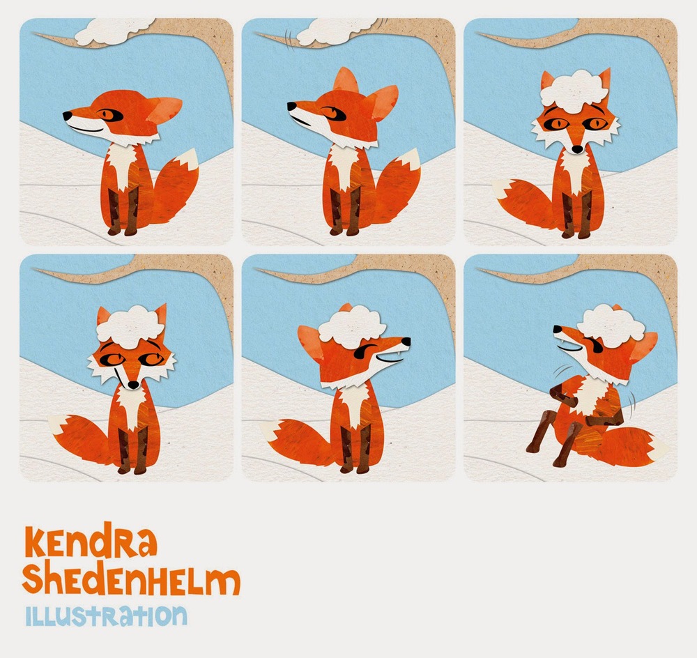
An early sequence
As I'd mentioned in yesterday's post, I am putting my first illustration portfolio together for the upcoming SCBWI conference, and I've been looking through my initial illustration work.
I found this piece that I created one Sunday morning in 2012. I'd just recently started to work with cut paper and collage, and I had a leftover square. I challenged myself to create a little story with it. This is what I came up with...
Early illustrations from my first illustration course
I've been putting my portfolio together for the upcoming SCBWI Conference in NYC in February, so I've been looking through a lot of old files and thinking about what kind of work I want to make in the future.
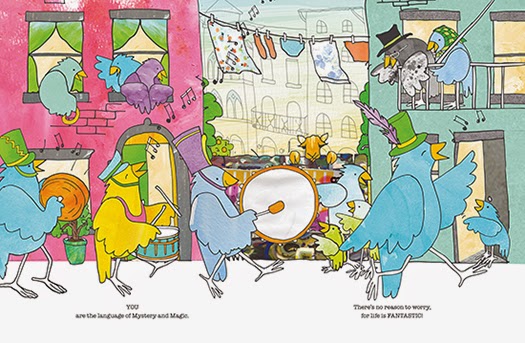
When I began my first illustration class in 2012, I hadn't painted since college (see this post for a little background), and I almost never drew anything by hand anymore. Carrying a sketchbook around was in the past for me, and almost everything I'd created in the previous decade was done on the computer. Although I really wanted to make art with my hands again, it felt uncomfortable and scared me. So I chose to work in Adobe Illustrator and got started.
Per Mark Mitchell's instruction, since I didn't have a story in mind, I went with a simple song to illustrate, Mary Had a Little Lamb. I started with a rough storyboard that I sketched using the pencil tool in Illustrator. Instead of Mary living in the country, I felt she should live in a Brooklyn-style city. I wanted the lamb's attempt to follow her to seem somewhat vast and overwhelming, and I wanted them to be happily reunited on a city street shortly thereafter. Below are some of my beginning illustrations:
Finding Mary
Looking for Mary
Happy Holidays!
We just returned from an incredible week in Florida with my in-laws, and I made this little collage on the plane ride home.
With tremendous gratitude to all of you, I wish you a very happy holiday!
xo,
Kendra

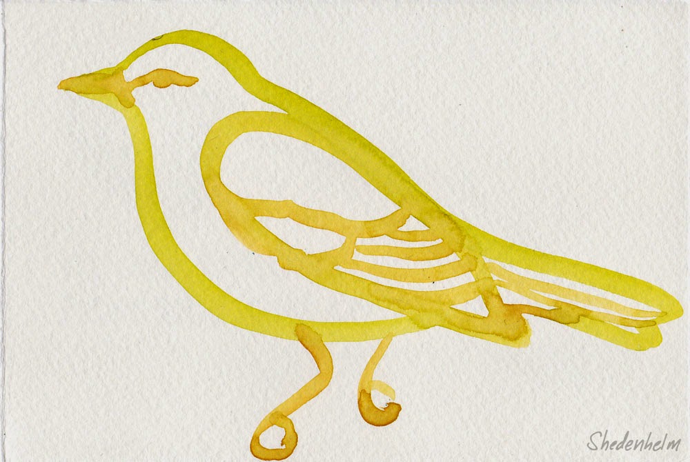
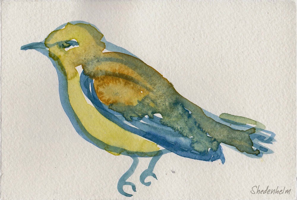
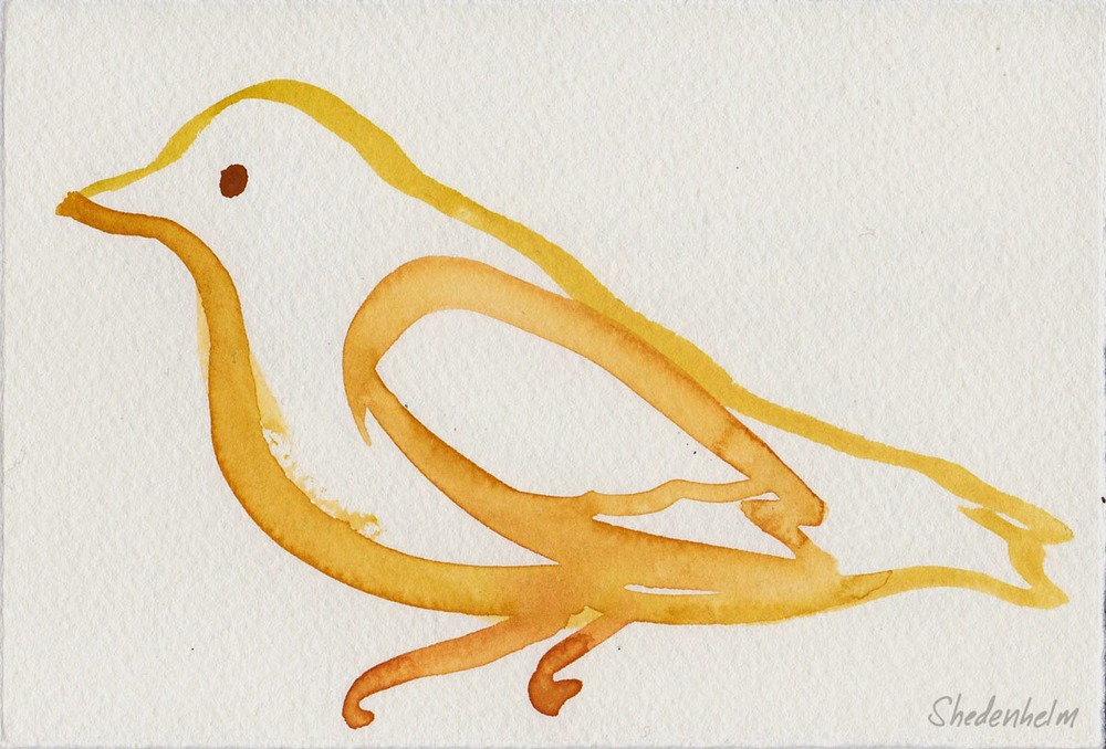
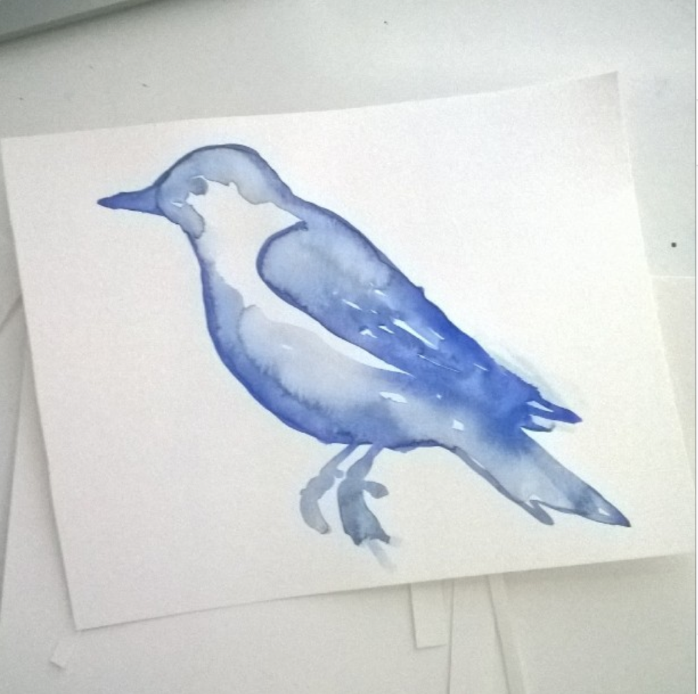
Random bird watercolor post
Lately, when I'm having difficulty getting into an assignment, I pick
up a brush and loosely watercolor. I find it helps me feel productive,
and the lazy brush strokes somehow free me to move forward.
I straightened up my studio space yesterday, and I found these warm-up sketches from last week. This blue one below is my favorite.
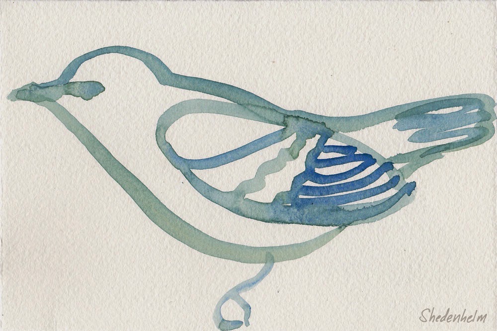
I straightened up my studio space yesterday, and I found these warm-up sketches from last week. This blue one below is my favorite.
Happy Thanksgiving! And my last MATS assignment
Happy Thanksgiving, everyone! Shawn, Archer and I have the great fortune of having several
family members stay with us in Croton-on-Hudson this holiday, and it
has been more fun than we'd even hoped.
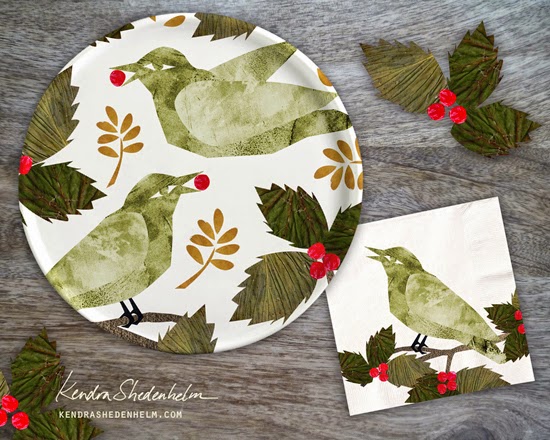
Before our guests arrived, I submitted my final assignment for Lilla Rogers' Make Art That Sells online course (Part B). For this last week, we focused on the Party Paper market (plates, napkins, cups, etc.), and our theme was flora.
The mini assignment was given to us on Monday, which was to gather and draw/paint flowers, leaves and anything that is currently growing in our region. On Wednesday, we received our actual assignment: use the art from our minis to design a plate and napkin for a party.
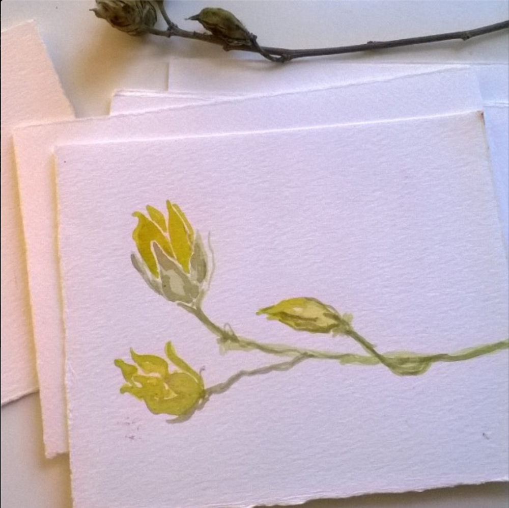
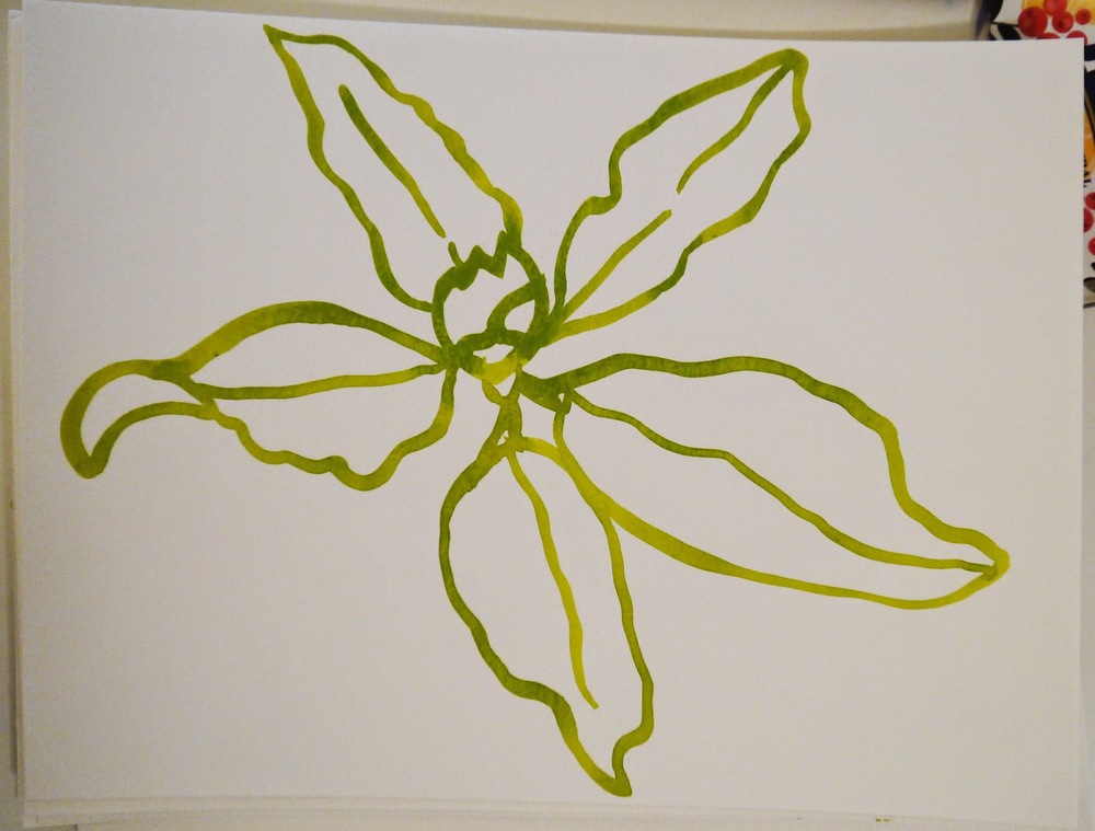
I spent most of the week creating watercolor and ink drawings of the dried leaves and plants I'd collected on my walks, but I kept thinking about the winter-ready holly bush right outside my window. It's so green and alive amongst the other bare bushes and trees, and birds stop by to eat the bright berries all day long while I work. The holly is festive, and with the guests' impending arrival, I imagined a wintry holiday party. The prickly shape of the leaves lent themselves to collage, and in the end, I went with this presentation below.
Below are some of the watercolor sketches from my mini assignment:
This was probably my favorite assignment in MATS B. Although none of Lilla's assignments are easy for me, I felt most at ease with the subject matter. It was a great way to end the course, and I look forward to her next class, MATS Bootcamp, which starts in January.
As always, your comments are welcome. I hope you're all having a tremendous Thanksgiving weekend!
Before our guests arrived, I submitted my final assignment for Lilla Rogers' Make Art That Sells online course (Part B). For this last week, we focused on the Party Paper market (plates, napkins, cups, etc.), and our theme was flora.
The mini assignment was given to us on Monday, which was to gather and draw/paint flowers, leaves and anything that is currently growing in our region. On Wednesday, we received our actual assignment: use the art from our minis to design a plate and napkin for a party.
I spent most of the week creating watercolor and ink drawings of the dried leaves and plants I'd collected on my walks, but I kept thinking about the winter-ready holly bush right outside my window. It's so green and alive amongst the other bare bushes and trees, and birds stop by to eat the bright berries all day long while I work. The holly is festive, and with the guests' impending arrival, I imagined a wintry holiday party. The prickly shape of the leaves lent themselves to collage, and in the end, I went with this presentation below.
Below are some of the watercolor sketches from my mini assignment:
As always, your comments are welcome. I hope you're all having a tremendous Thanksgiving weekend!
Holiday Promo Card
I really want to send out promotional postcards this holiday season, so I took advantage of Moo.com's latest sale.
Below is a potential front (my name will be on the back). What do you think?
Below is a potential front (my name will be on the back). What do you think?
You, the Magician
Well, we did it! One year and stacks of sketches later, "You, the Magician" is now available for purchase at youthemagician.com.
I'll blog more later this week about my art process for this book, but for now, please check out their Facebook page at facebook.com/youthemagician. Here, you'll find more information about the book's wonderful and magical message, plus an introductory reading of the book by authors, Josh Carothers and Jodi Maestas Carothers. Take a look!
I'll blog more later this week about my art process for this book, but for now, please check out their Facebook page at facebook.com/youthemagician. Here, you'll find more information about the book's wonderful and magical message, plus an introductory reading of the book by authors, Josh Carothers and Jodi Maestas Carothers. Take a look!
Scrapbooking and icons
Although I have never really connected with the world of scrapbooking, I approached Week 3's Scrapbook Market assignment from Lilla Rogers' MATS B course with an open mind.
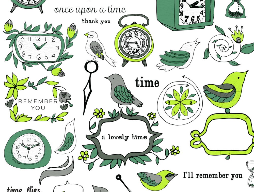
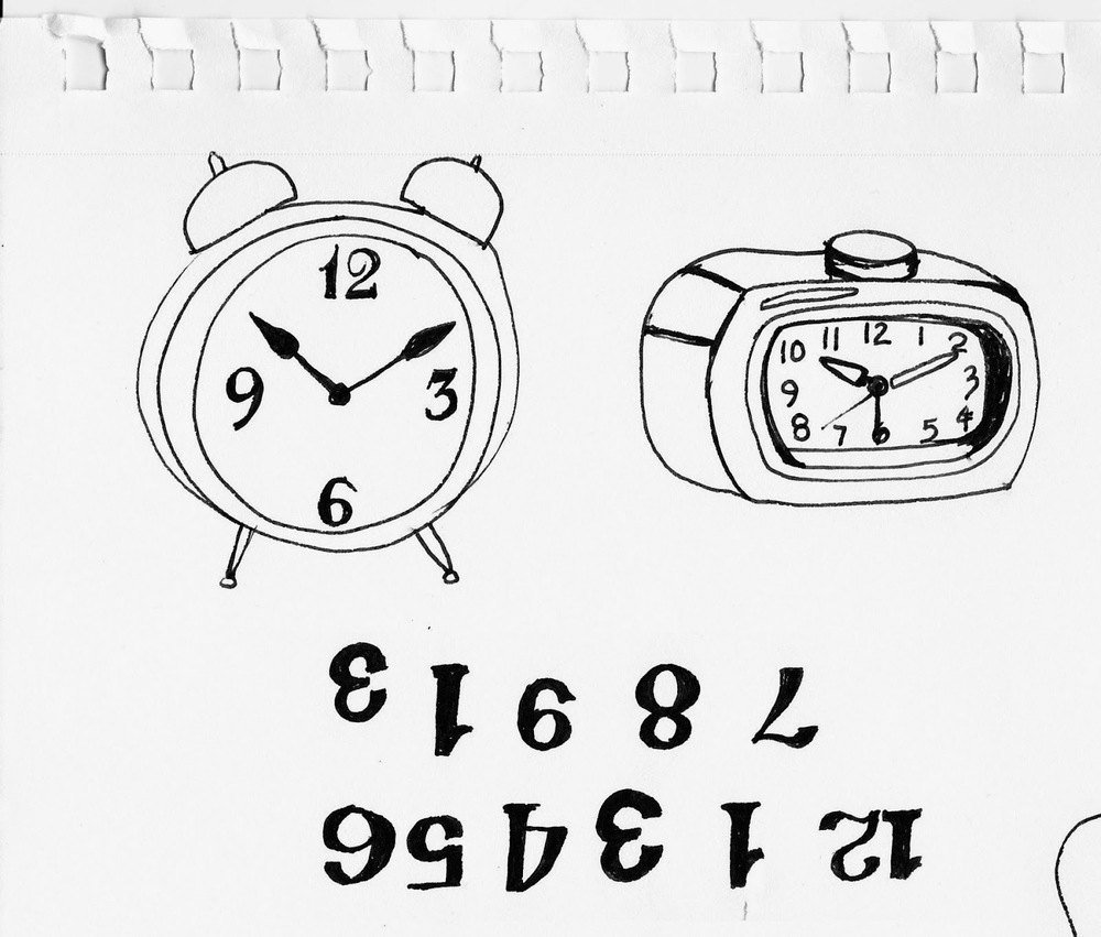
For Monday/Tuesday, our task was to research and draw vintage clocks. On Wednesday, we received our final assignment, which was to create a full sheet of scrapbook icons, utilizing clocks, time and anything time related.
Lilla continually stresses the importance of creating icons (for all markets), but I find them difficult. In the back of my mind, they feel like clutter, and I fight them. I am getting better at them, however, and I am adding more tidbits and little extras. Below are some of my sketches and a snippet of my final assemblage with a color change.
As Lilla says, the great benefit of creating icons is that I now have more to work with. Although I'm not jazzed by my green/yellow color and texture choices for this submission (bottom image), I can make some tweaks and use several of these elements for other things. More icons = more ideas and more opportunities. Keep an eye out for re-use of these birds and flowers for sure.
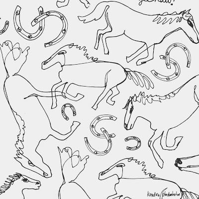
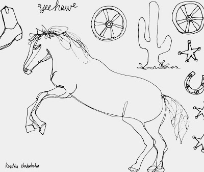
Cowgirls/cowboys and baby apparel
My second week with Lilla Rogers' MATS B course focused on the baby apparel market. I've printed on many onesies for my Etsy shop over the years, but I know very little about creating a pattern, or the popular market, so I was looking forward to this one.
The assignment was to create a cowgirl/cowboy-themed print for a onesie and/or baby dress. I thought it was a super cute theme, and I messed around with a few cowgirl and silly horse characters, but I just couldn't get into it. I then tried some collage forms and chunky "yee-haws!," but it just wasn't coming together for me. So I decided to simplify, and I began gesture sketching horses running and galloping. And though it didn't turn out very baby-ish, I really enjoyed drawing for this.
Below is my final submission, followed by a couple of other sketches.
Your comments are always welcome!
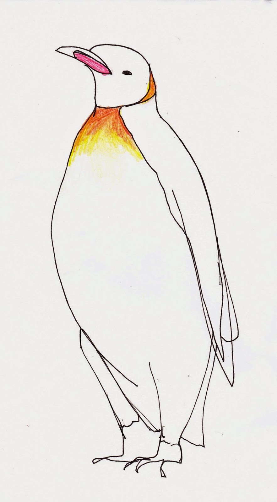
Another class with Lilla Rogers begins...
The much-anticipated e-course with Lilla Rogers started this past Monday. If you've read my previous posts, you know that I really love taking classes with Lilla. Something about her approach keeps art-making exciting, and not so scary. I find myself more courageous and enthusiastic, and I truly value what I learn in each week's assignment.
This first week of Part B focused on the Paper Market — greeting cards, stationery, journal covers, etc. Lilla begins every assignment with a creative warm-up, or a "mini," where we spend two days just exploring and sketching a specific subject (not concerning ourselves with any end result). This week's mini was about penguins and igloos. After some research, I realized quickly that I was very attracted to the Emperor Penguin, and I spent a great deal of time drawing these penguins with colored pencils, ink and watercolors.
On Wednesday, Lilla asked us to take our sketches and ideas and turn them into a greeting card. I wanted to translate my penguin sketches to a bolder style, and I began to work in collage. I tried some initial cut outs, just to help me visualize the shapes, and then I began to assemble my various penguins.
Directly below was my final submission. Further below are some of my other creations from throughout the week. As always, your comments are encouraged and welcome!
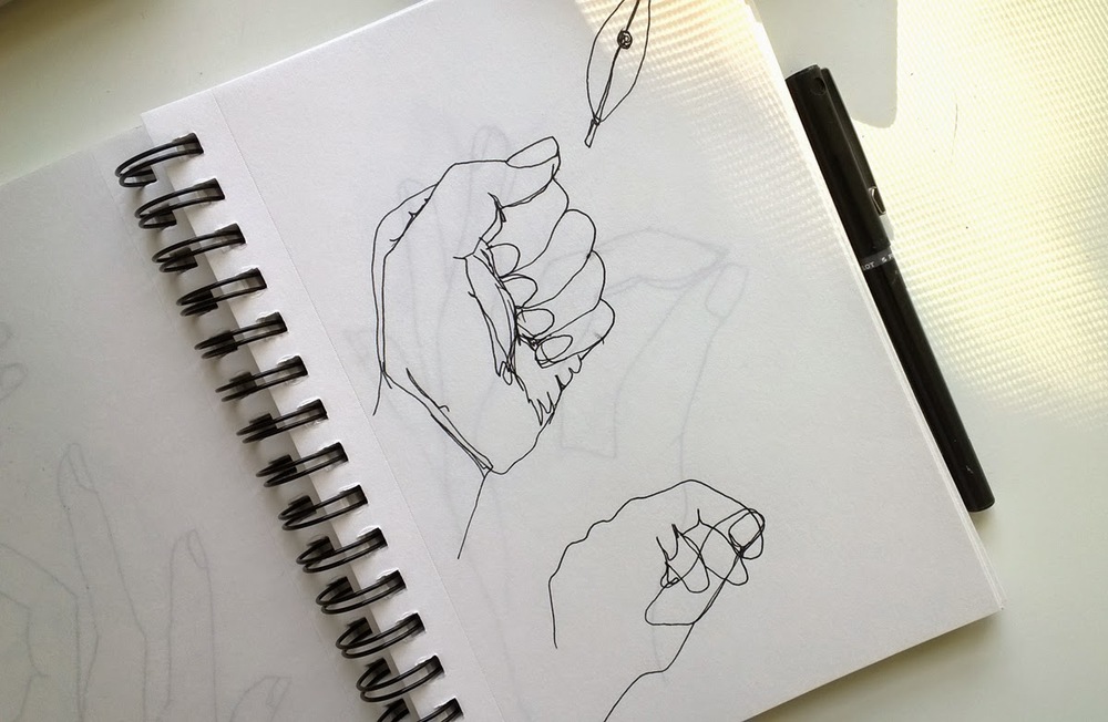
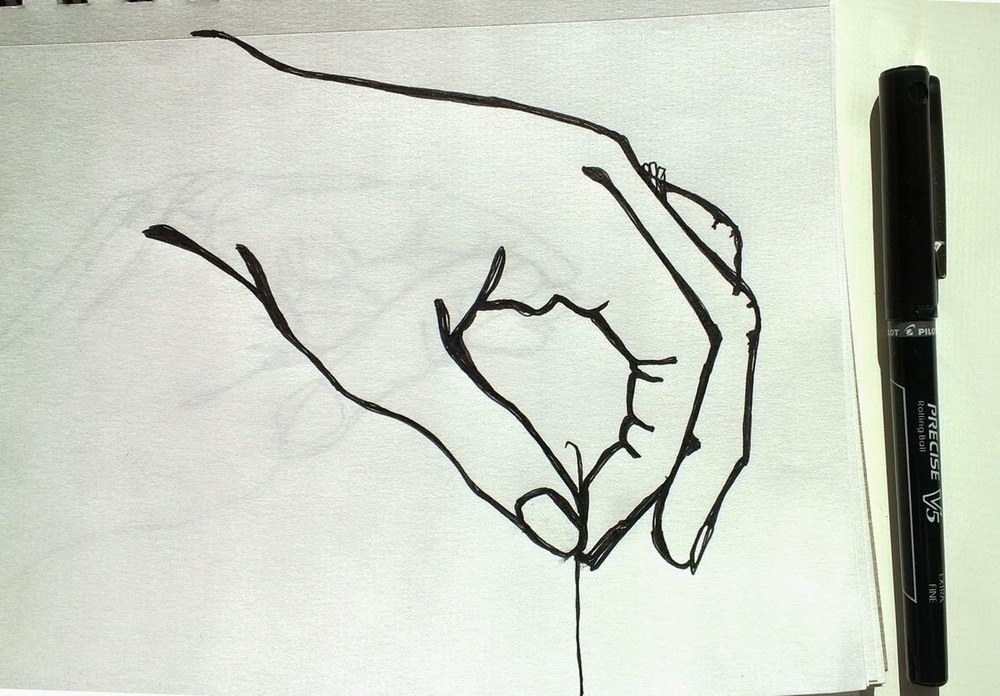
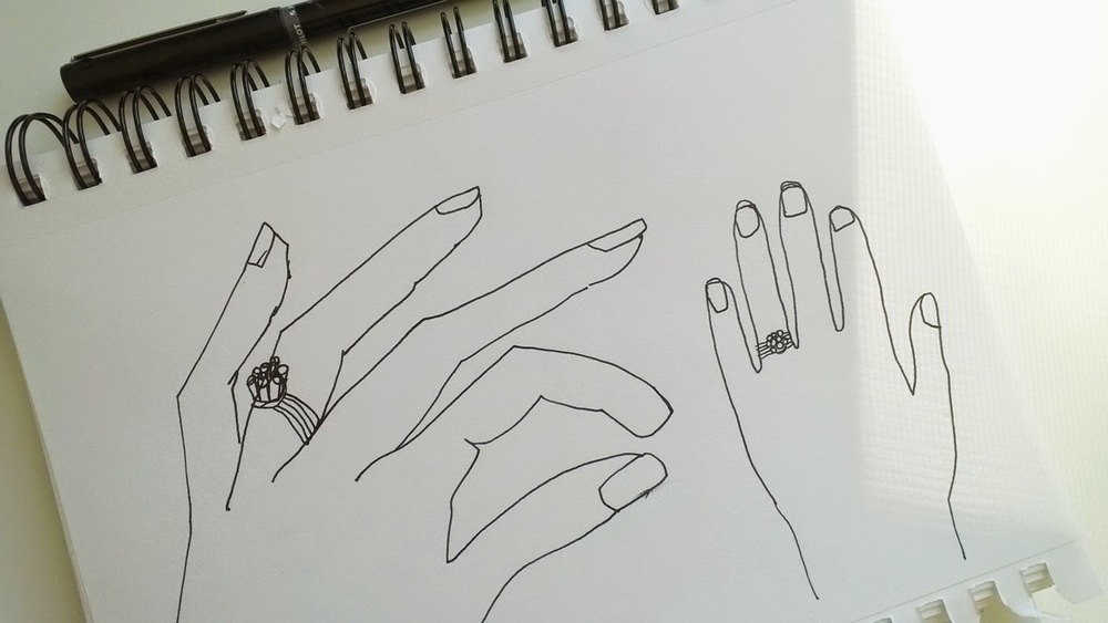
Day 4 of Von Glitschka's 21 Day Drawing Challenge
For Day 4 of Von Glitschka's Drawing Challenge, the task is to draw your own non-dominant hand in several ways. I drew a lot of hands, but it was difficult for me to work in different styles. No matter which style I had in mind, I still kept drawing a similar type of hand. A challenge for sure. Here are some of the less-same sketches of my hand...
Day 3 of Von Glitschka's 21 Day Drawing Challenge
For Day 3 of Von Glitschka's 21 Day Drawing Challenge, we were provided a print out filled with random shapes. The task is to fill in the shapes and "draw what we see."
Here's a section of what I've created so far...
Here's a section of what I've created so far...
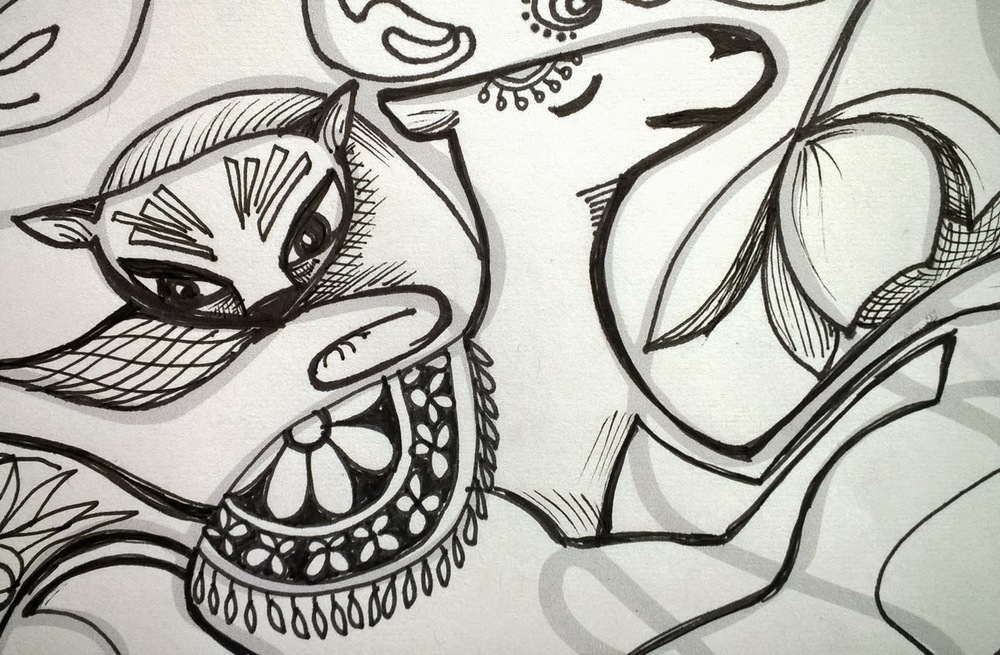
Von Glitschka's 21-Day Drawing Challenge, Day 1
I love Lynda.com, and I'm a huge fan of Von Glitschka's videos. When I saw that Von had come out with a 21-Day Drawing Challenge a few weeks ago, I knew I wanted to do it.
After a brief (and insightful) introduction to the purpose and usefulness of drawing, I started Day 1: draw a cat. Any cat and in any way. Just begin.
I chose my cat and companion, Milla, as my subject, and I decided to sketch her with a pencil -- something I rarely do anymore. Not sure how I'll finish her up, but stay tuned for Day 2...
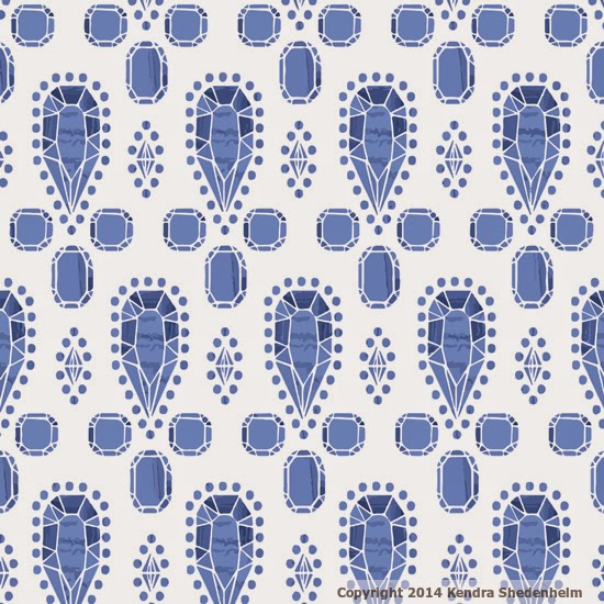
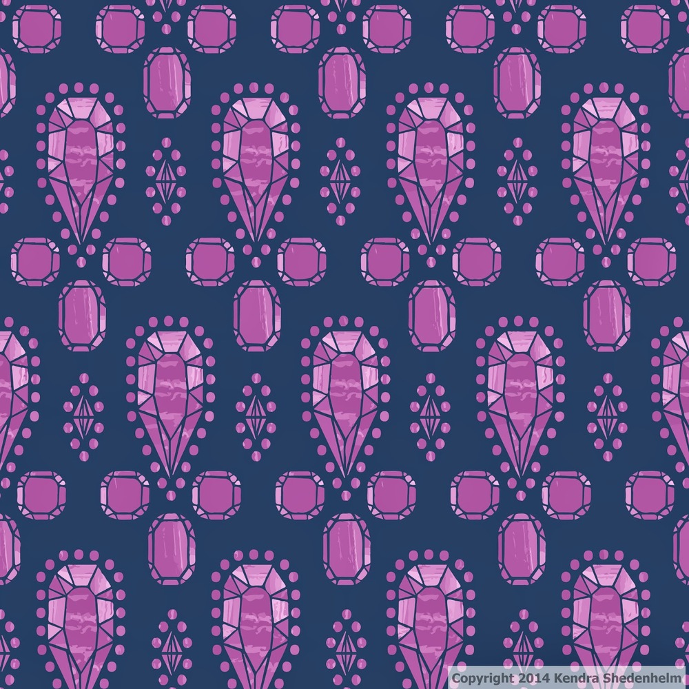
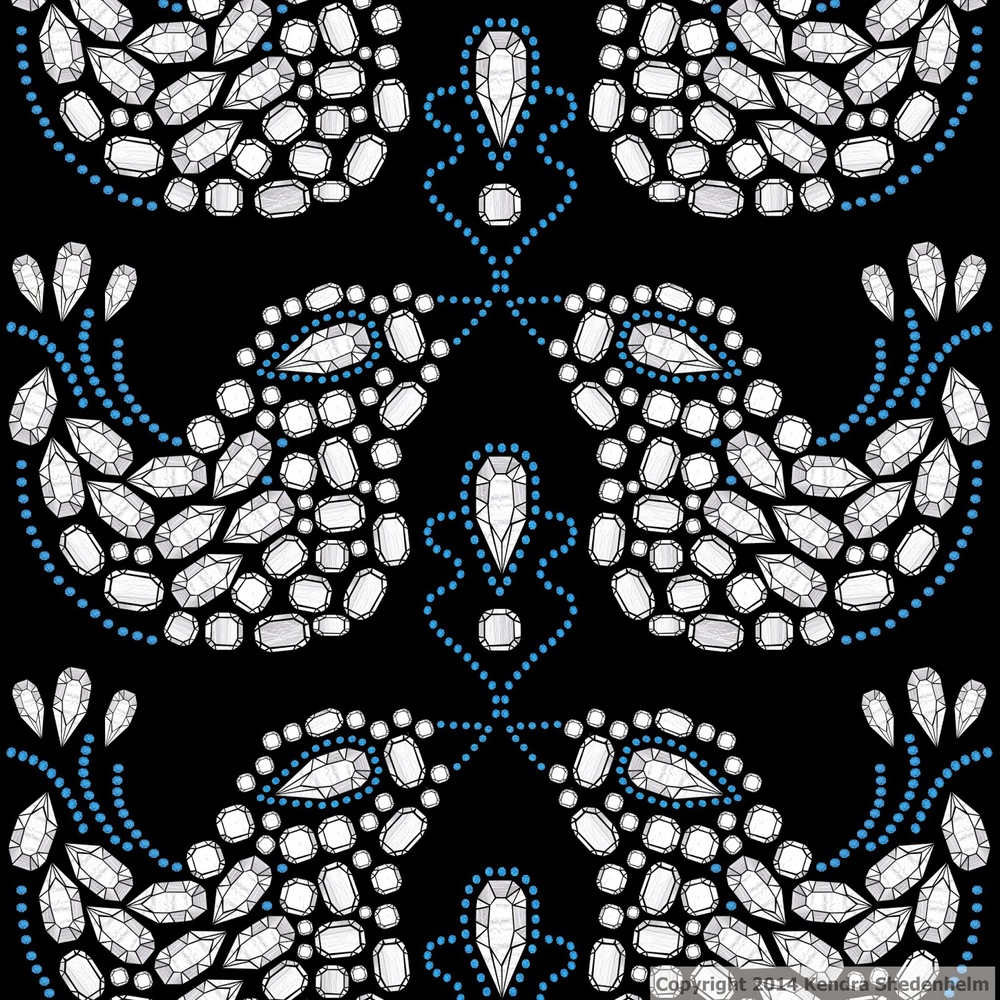
Jewels and Gems: my final assignment for Make It In Design's summer school
Thursday afternoon was the deadline for my third and final beginner's assignment for Make It In Design's free summer school course. The pattern focus was jewels and gems.
Aside from my wedding ring, I am a jewelry-less person and I just wasn't sure how I was going to get inspired. So I bought toned papers and white pencils, and I drew lots and lots of geometric shapes and sparkly bursts. As I continued to look around at gowns and haute couture, though, I realized that I was drawn to more chunky (and sort of klunky) gems. And I felt collage was a better way for me to go.
Navy is my favorite color, so I paired that with a silvery-white gem collage and submitted this design below. Some of my other ideas and runners-up follow.
I'd love to know what you think, and which one you like best?
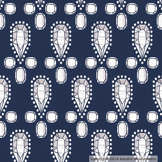
Just found this reminder for the Tomie dePaola contest (and now I'm a semi-finalist!)
I keep a large NeuYear calendar on my studio wall. It's so big that I had to cut it into four sections. I can post two sections up at a time, which gives me a good six months of reminders and goals that I want to look at — in large type — every day. The reminders are generally about upcoming freelance work, deadlines or doctor's appointments. The goals are often written months in advance: "complete postcard mailer," "contact this agent," "submit to such-and-such contest." The goals might feel unattainable at the time that I write them on my calendar, but by looking at them daily, I feel much more prepared when the time comes.
Anyhow, as I packed up section 2 of my calendar, to make way for section 4, I saw this little reminder about the Tomie dePaola contest. It says "Don't give up."
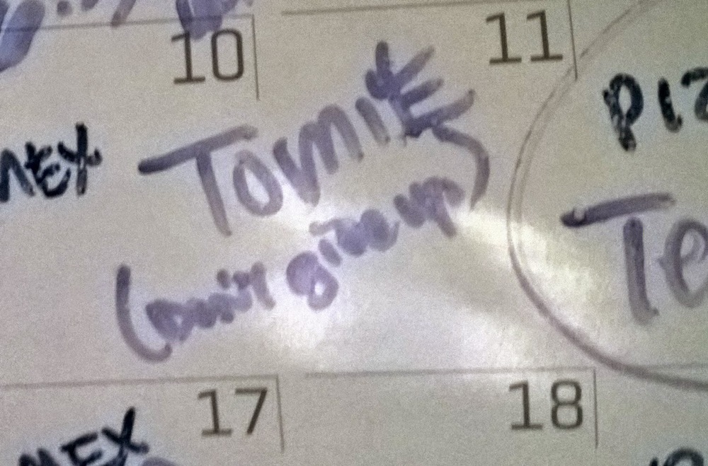
I had written this message to myself several weeks before. When that week finally arrived, it ended up being a very busy time for me. Had I not re-read this note, I might not have submitted anything at all.
And now, guess what? I'm a semi-finalist! In a few days, I'll be getting my next assignment, and you can bet I'll be tacking up encouraging notes to myself all over my house. (It really helps!)
You can check out my initial post about my 2014 submission here, or check out all the semi-finalists' work on the SCWBI website here.
Anyhow, as I packed up section 2 of my calendar, to make way for section 4, I saw this little reminder about the Tomie dePaola contest. It says "Don't give up."
I had written this message to myself several weeks before. When that week finally arrived, it ended up being a very busy time for me. Had I not re-read this note, I might not have submitted anything at all.
And now, guess what? I'm a semi-finalist! In a few days, I'll be getting my next assignment, and you can bet I'll be tacking up encouraging notes to myself all over my house. (It really helps!)
You can check out my initial post about my 2014 submission here, or check out all the semi-finalists' work on the SCWBI website here.
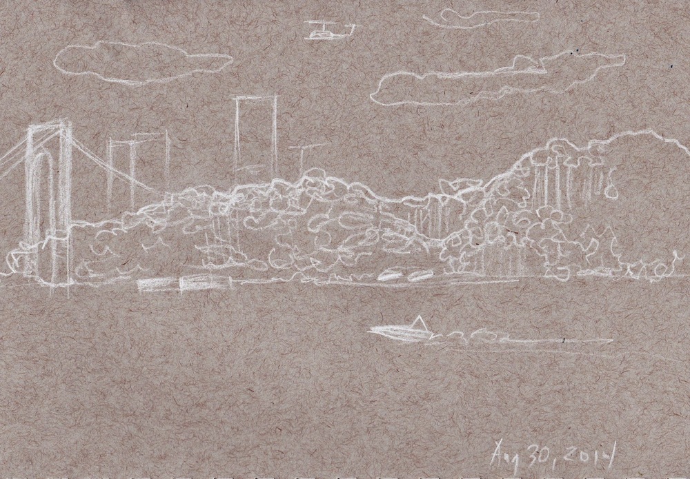
Quick sketch on the train ride to Grand Central Station
Today I took the train to the city to run in Central Park and to meet some friends for a drink. On the way in, my train was delayed for a bit, so I tried out my new white pencil/grey-toned sketchbook combo. I found the pencil a little rough and uncomfortable, and I was hoping for more contrast, but here's my sketch while the train was held up for a few minutes:
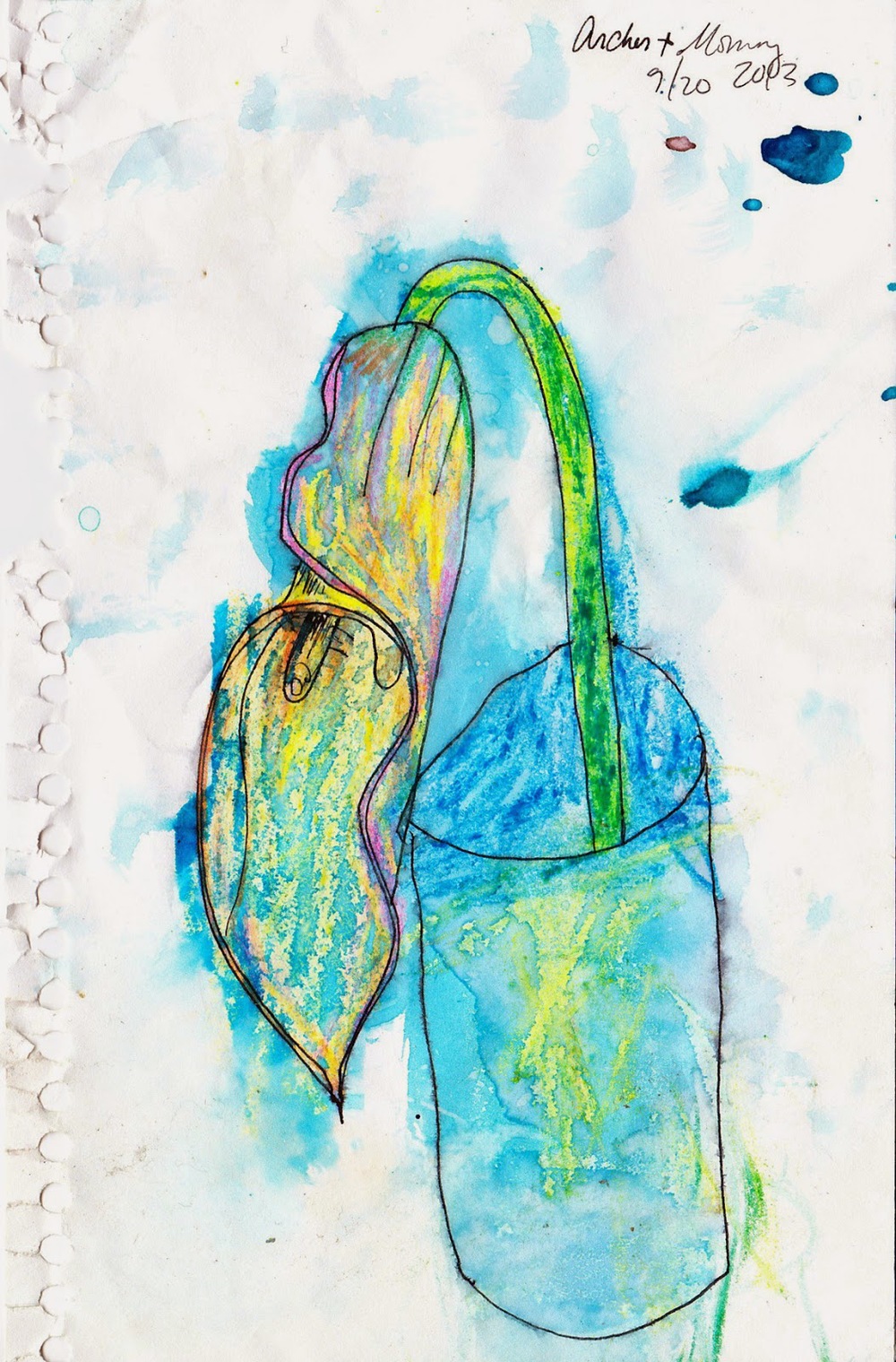
I found another Archer-collaboration this morning
As I mention in many of posts, I love to collaborate with my son, Archer. One of us will start with a drawing or painting, and the other will finish it however we see best. I've used his work in this piece, this one, here, here and many others. This process of working together is not only just fun for me, but by embedding the moment in art, I get to extend the memory of being with him.
This morning, I've been cleaning out his room, recycling old papers from kindergarten, and making space for first grade. Among the piles, I found this little collaboration from the beginning of last school year. We made this on a day that we were both particularly homesick for Brooklyn. He'd come home from school, and we sat in front of our new house, both sad and unsure of how to spend our time. I'd suggested we make something together again.
I'm so glad we did. Like looking back at a journal entry, it's such a wonderful way to remember where we've been, and how much we've changed over this year.
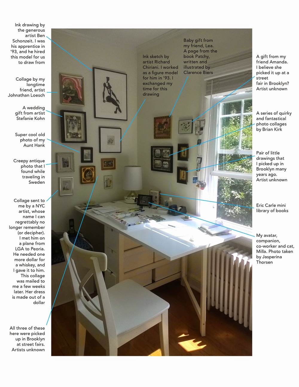
My studio right now, and do you know this artist?
I love it when people share their workspace. I'm always curious about the little things they surround themselves with. Today, I was looking around my own studio, and I wanted to share what I look at every day when I work. But I also wanted to see if anyone can help me identify some of these "Artist Unknown" pieces.
In the lower left corner is a collage sent to me by a NYC artist, whose name I regrettably no longer remember (and I can't decipher his signature). I sat next to him on a plane from LaGuardia to Peoria. He needed one more dollar for a whiskey, and I offered him one. A few weeks later, I received this collage at my work. The woman's dress is made out of a dollar bill. I just loved it. I believe he lived in SoHo or the Lower East Side. He might be about 50 or 60 by now. Take a look at the signature in the closeup below. Do you know who this artist is?
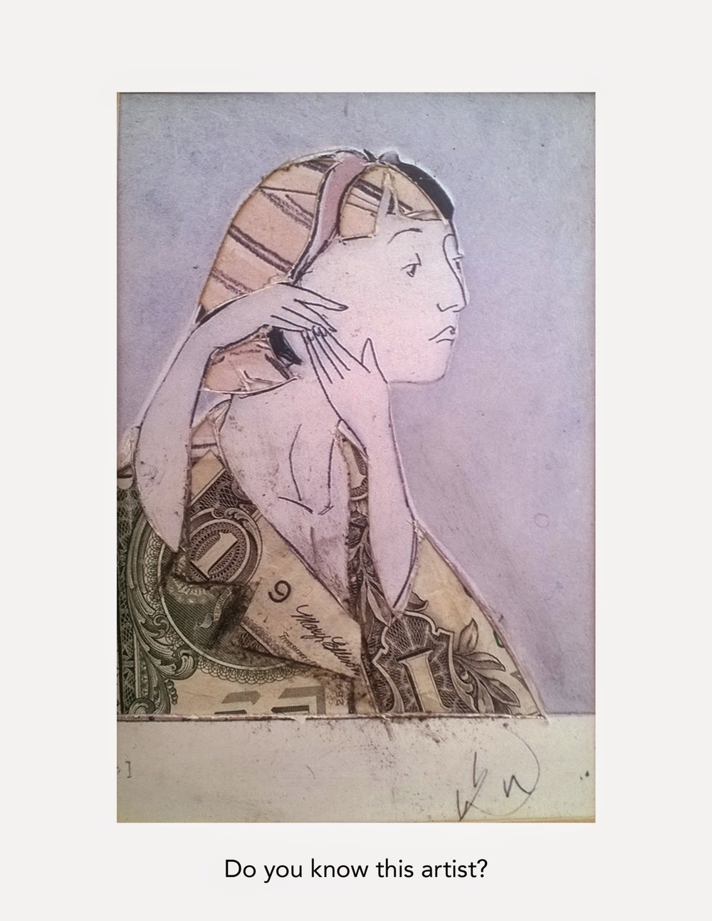
In the lower left corner is a collage sent to me by a NYC artist, whose name I regrettably no longer remember (and I can't decipher his signature). I sat next to him on a plane from LaGuardia to Peoria. He needed one more dollar for a whiskey, and I offered him one. A few weeks later, I received this collage at my work. The woman's dress is made out of a dollar bill. I just loved it. I believe he lived in SoHo or the Lower East Side. He might be about 50 or 60 by now. Take a look at the signature in the closeup below. Do you know who this artist is?