Eric Carle's "What's Your Favorite Animal?" Project
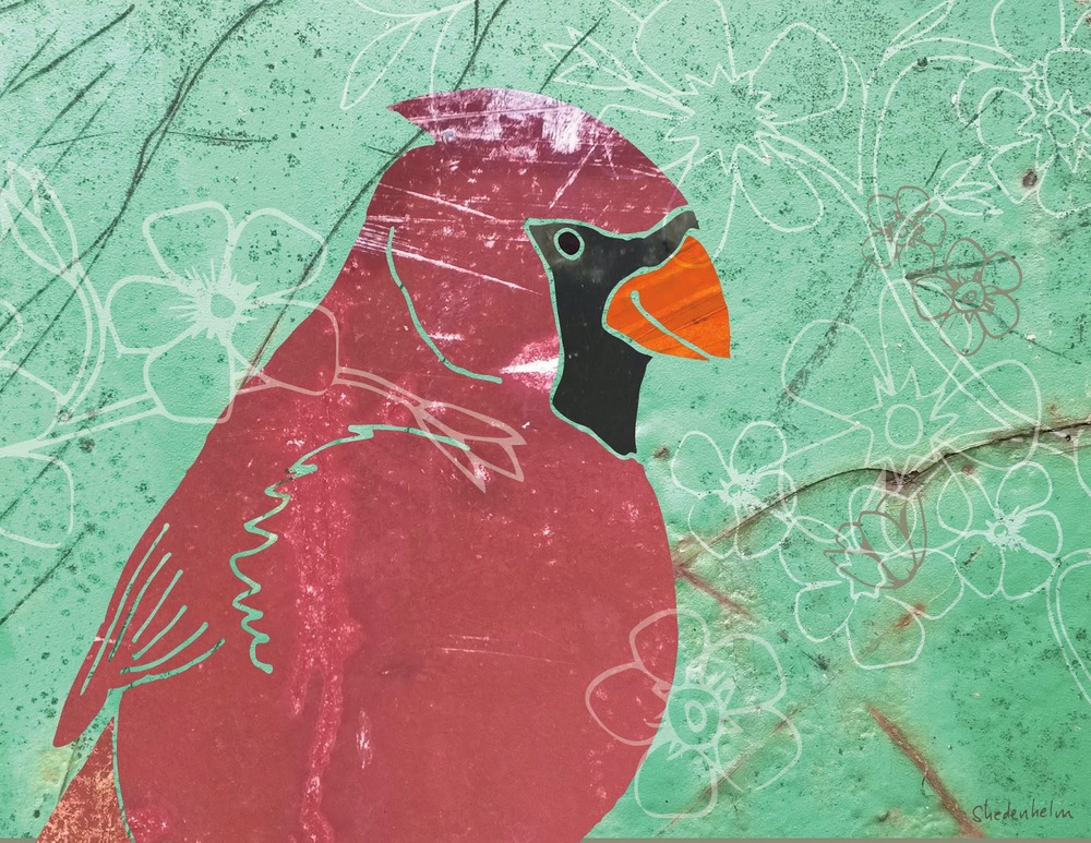
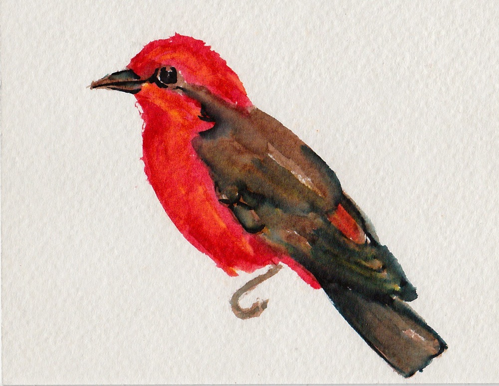
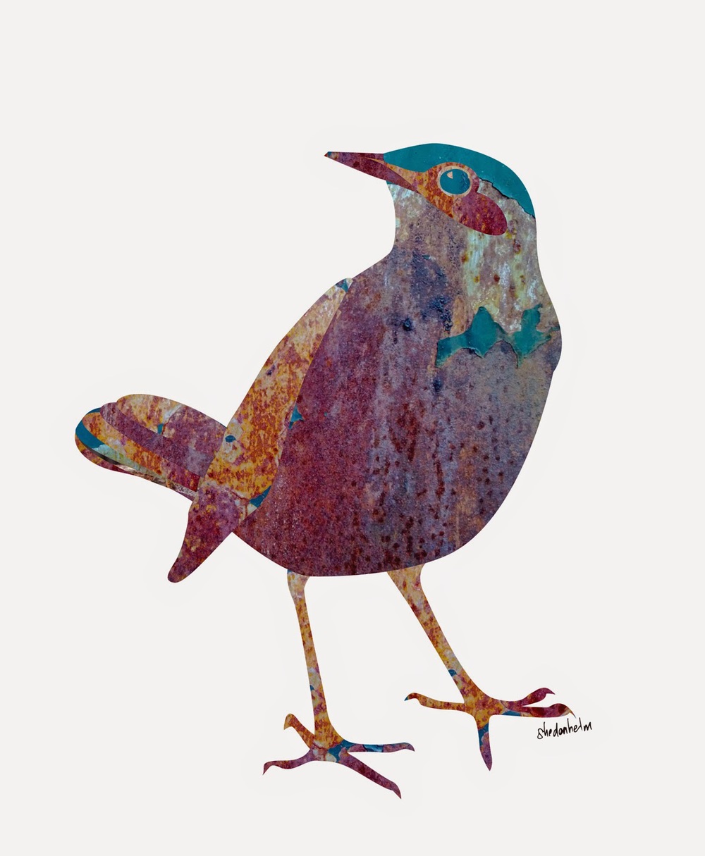
A few months ago, I saw that there was a digital exhibition at the Eric Carle Museum, called the "What's Your Favorite Animal?" Project, and anyone could upload their art to the online gallery. I've been prodding my son almost daily to create something for it, but today I decided to let him off the hook and just create something for it myself. I submitted this piece, titled Cardinal.
If you or your child would like to participate, submissions are still being accepted until August 1st, 2014, and the online gallery is on display here through August 31st. I highly recommend that you take a look at all the amazing art!
Reviving and recycling my art
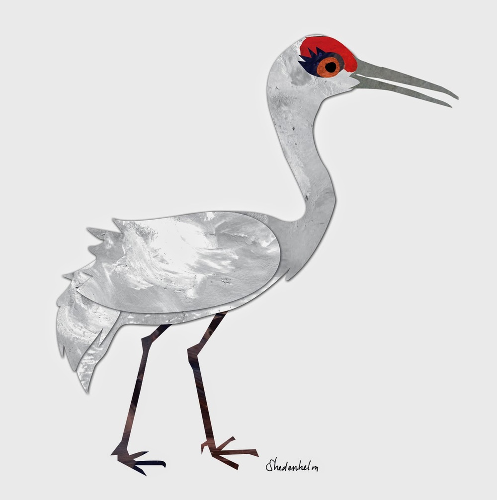
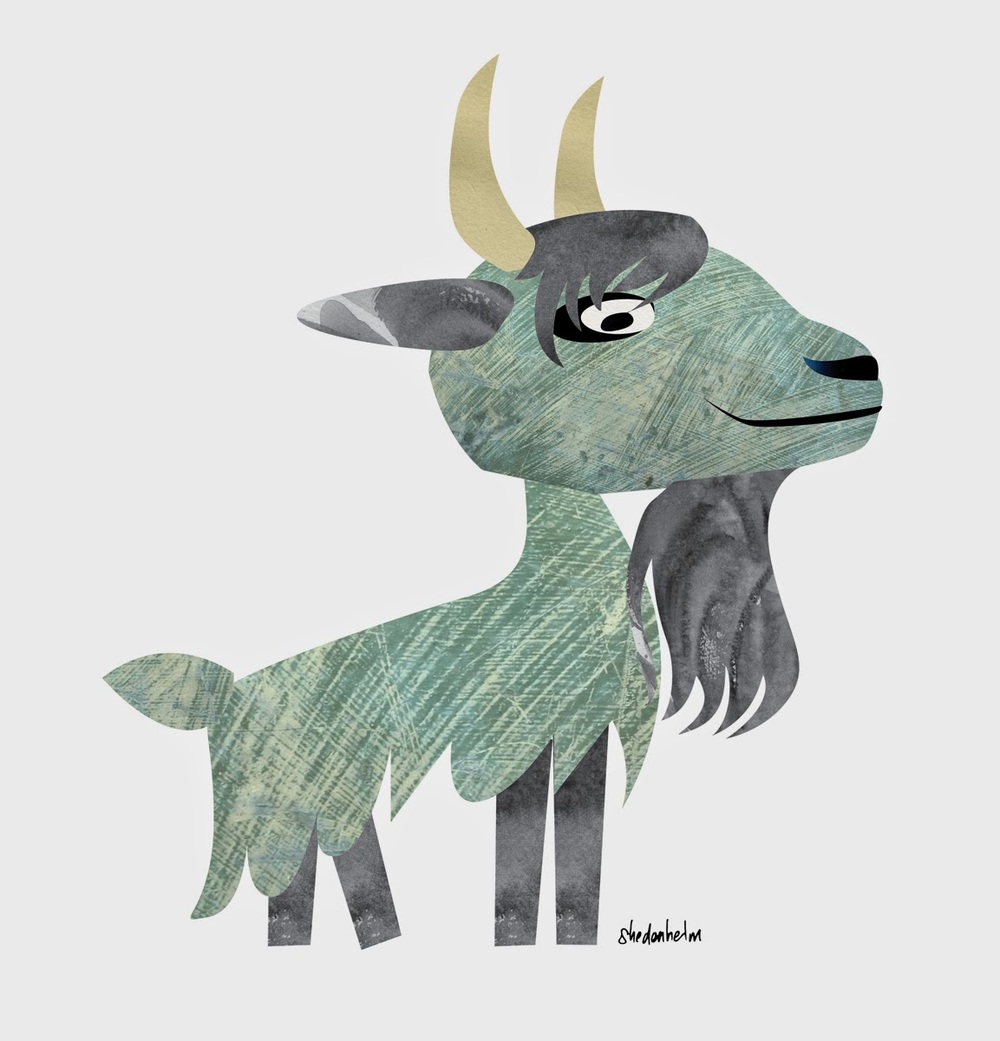
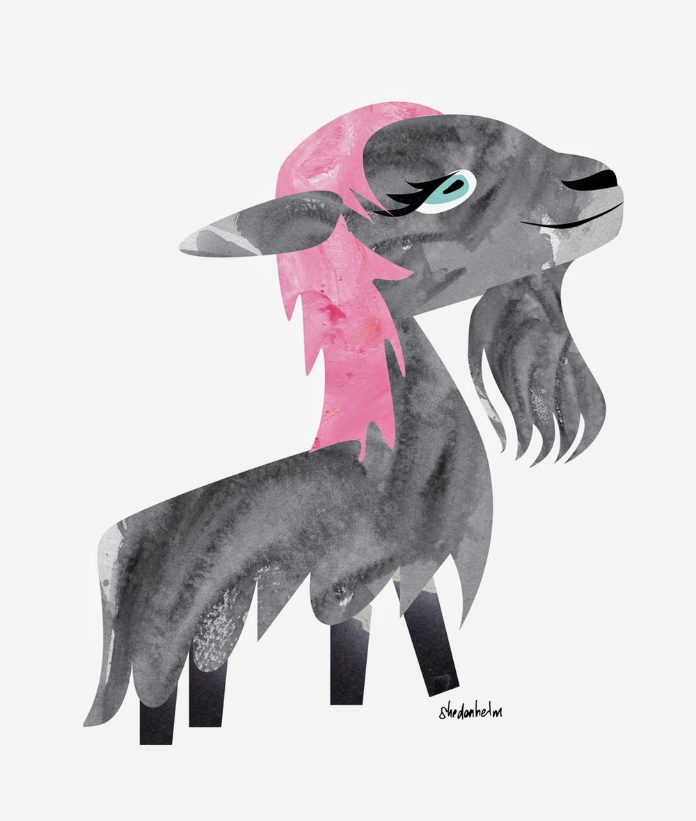
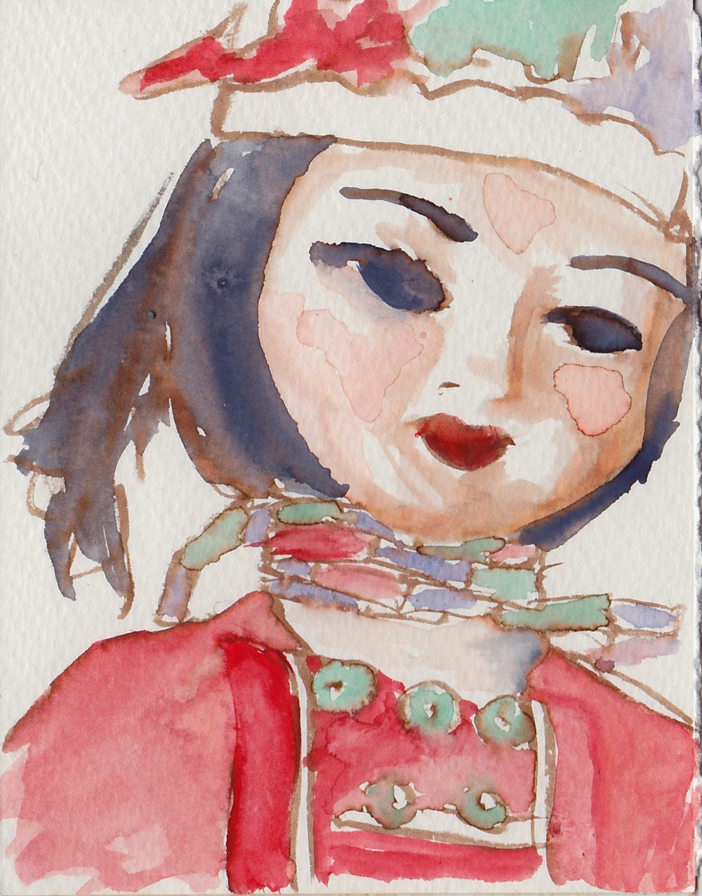
A couple of days ago, I ran across some art that I'd created for a client a few months ago. It was ultimately never used, and I suppose I felt it wasn't any good because of it. But when I saw these characters again, I realized how much I did like them, and how much I could see myself in them. I even put a couple of them in my society6 shop, so that I could create prints. And perhaps I'll turn this Crane into a baby onesie.
Though much of my art that I've rejected probably will stay in a folder somewhere, as I get more comfortable in my art-making skin, I can see me and my process in the bad stuff too. And I find that I appreciate those castoffs more and more.
Boats, wall art and MATS Bootcamp
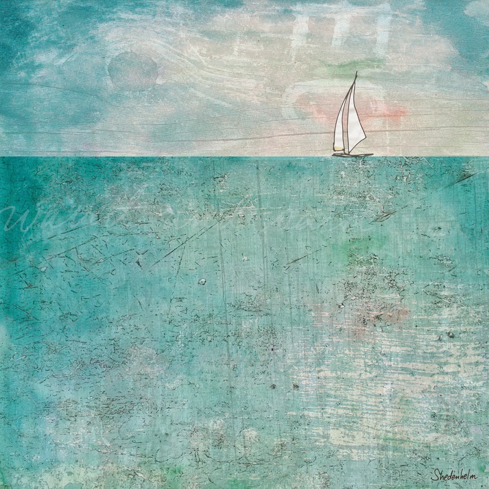
We had a week to play around, sketch and experiment with these ideas, and at the beginning of the second week, we were given the assignment: square-shaped wall art.
I knew that I wanted to focus on boats, so I drew gobs of sailboats and pirate-y boats, and I assembled them over a variety of background textures. I still haven't decided which final piece to submit, but these two are the contenders. Your feedback is most welcome!
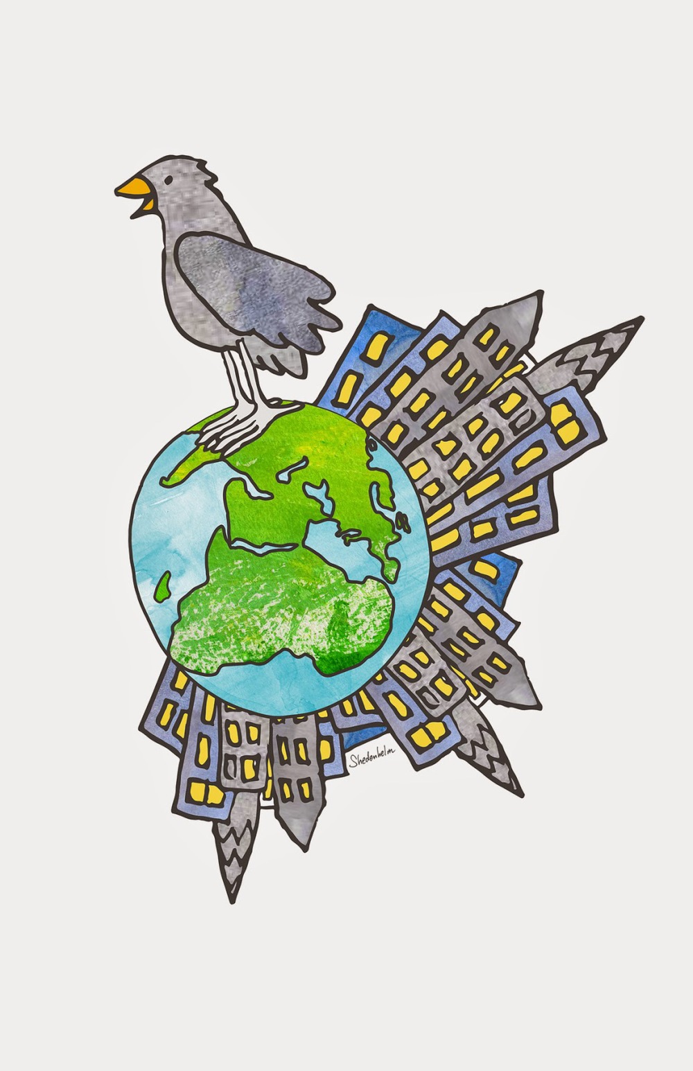
The Happy Earth Bird
Creating a new character and sequence, and the Tomie dePaola contest
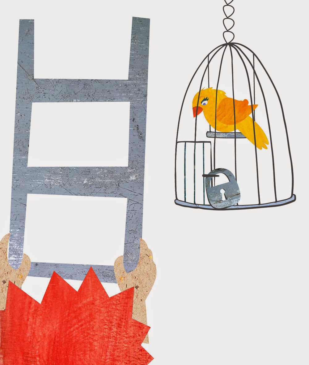
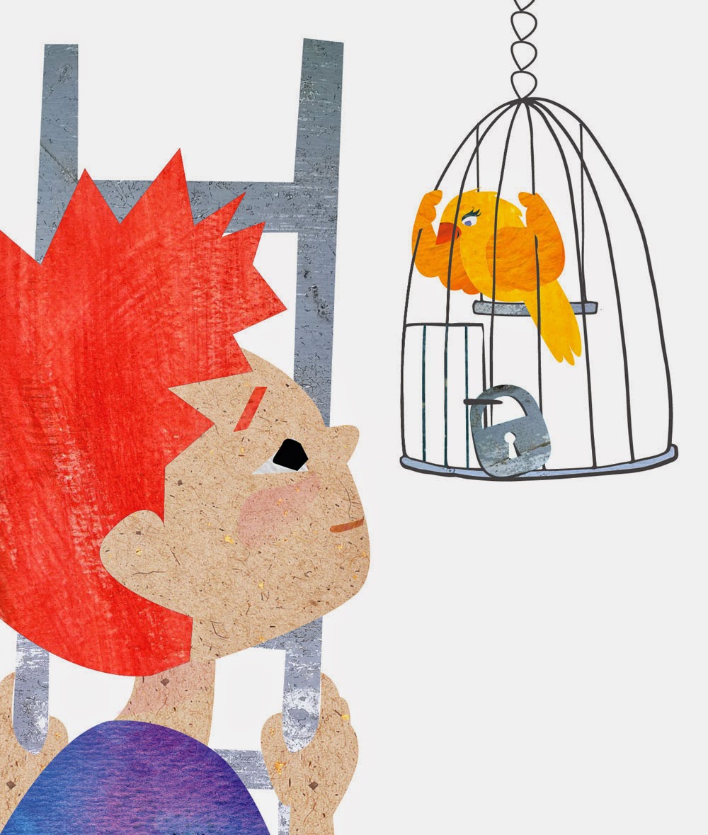
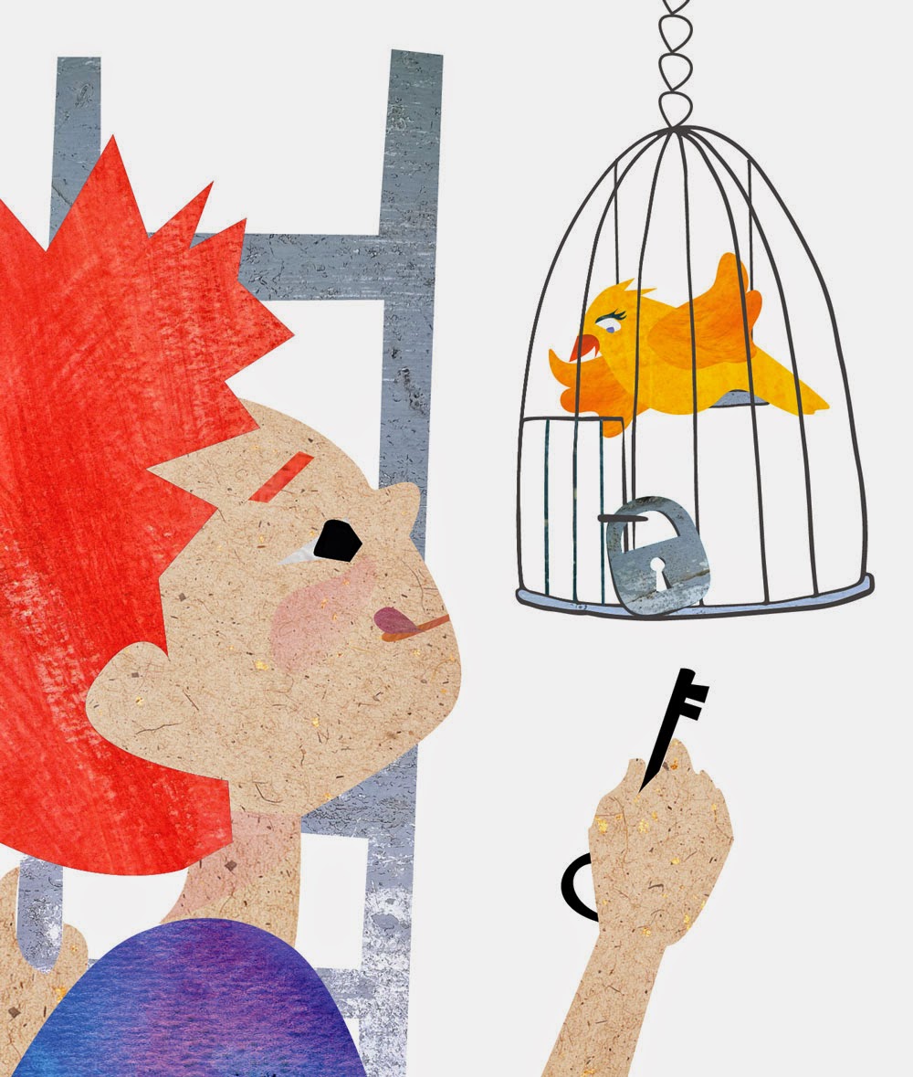
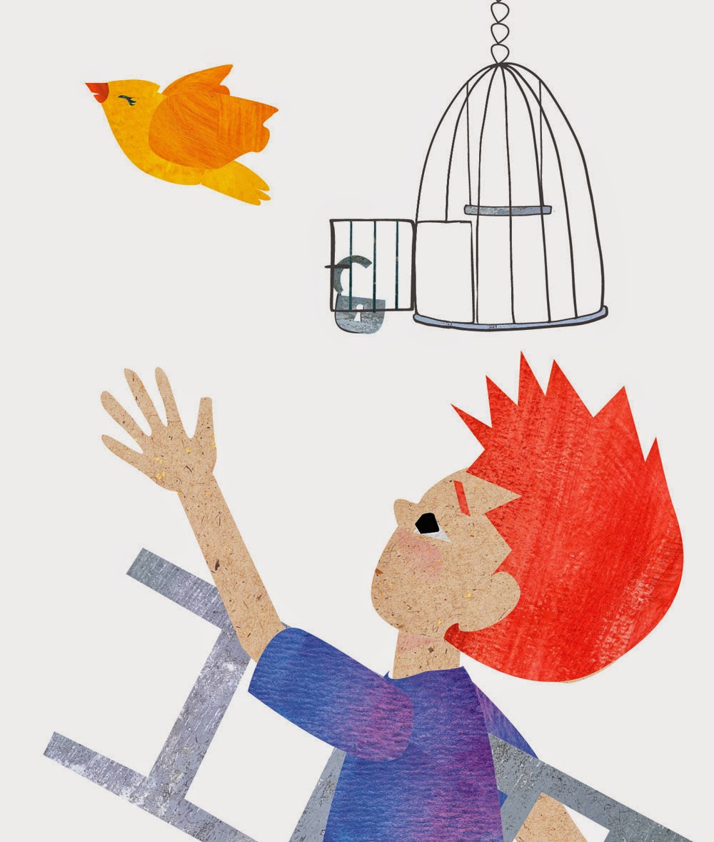
The assignment was "to create a six-panel sequence that has a beginning, middle and an end that is obvious, featuring a character of your own invention. It can be funny, sad, dramatic or ordinary, but interesting and with lots of invention and finesse, and depicting emotion in 4 to 6 frames."
While I could have done more with the background, and with adding more details, I had many new ideas by working on this. My five year old son felt very strongly that the bird would not fly away forever, and we made up several stories of what they might do together next.
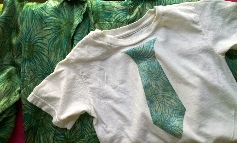
A quick DIY tie for my kid
My first editorial illustration
I've had a growing curiosity about editorial illustration, and I was excited when Lilla Rogers assigned a magazine ad for this month's MATS Bootcamp class. We were asked to create a full-page, magazine illustration to coincide with this article on meditation by Grace Suh, titled "How to Meditate: A Primer for People Who Don't Like to Meditate."
I wanted to convey a person who was unable to immerse themselves in meditation, amongst others who seemed to do it so easily. This was my final submission:
Your comments and suggestions are always welcome!
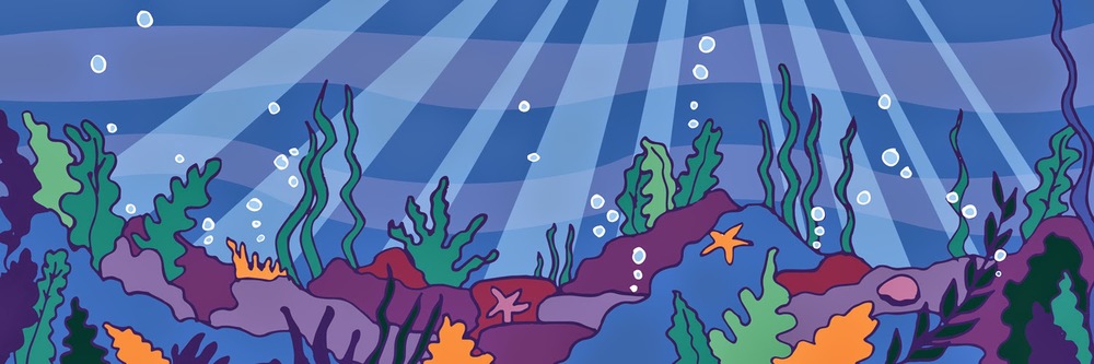
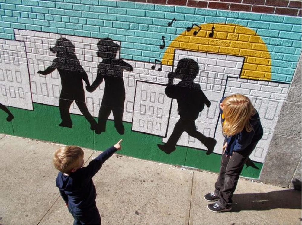
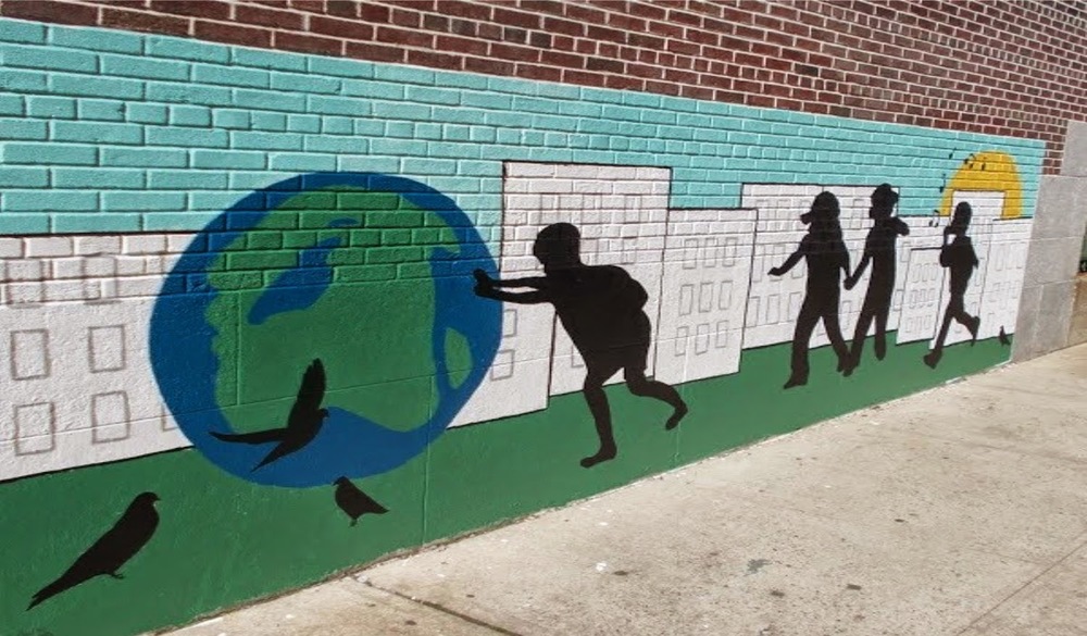
Last-minute underwater mural for a Brooklyn school and mural design for a team
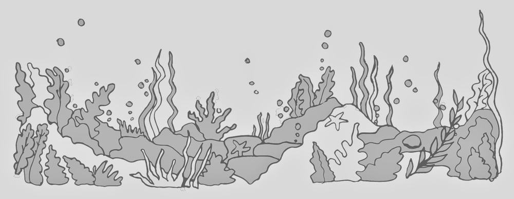
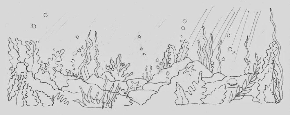
Here are my sketches and final design (if I get any pictures, I will post the finished painted piece):
When I first started designing murals for NY Cares in 2004, I had no idea how to create something that could be painted successfully by a third party. My designs were too complicated, using complex shading or foreshortened images that weren't understandable to a group of volunteers. Or, my sketches were too vague and gestural, and the volunteers were unable to decipher my drawings well enough to paint them accurately.
As I have learned to keep my mural layouts simple and clear, I find that the experience for the volunteers is a heck of a lot less overwhelming, and they seem to walk away feeling excited and proud of the final work.
One of my more successful experiences was with a team of volunteers from Crossfit718. Because of the legibility of my drawing and the simplicity of the colors and shapes, these women were able to paint with enthusiasm. They got it. Their attitudes were positive, and they did an outstanding job.
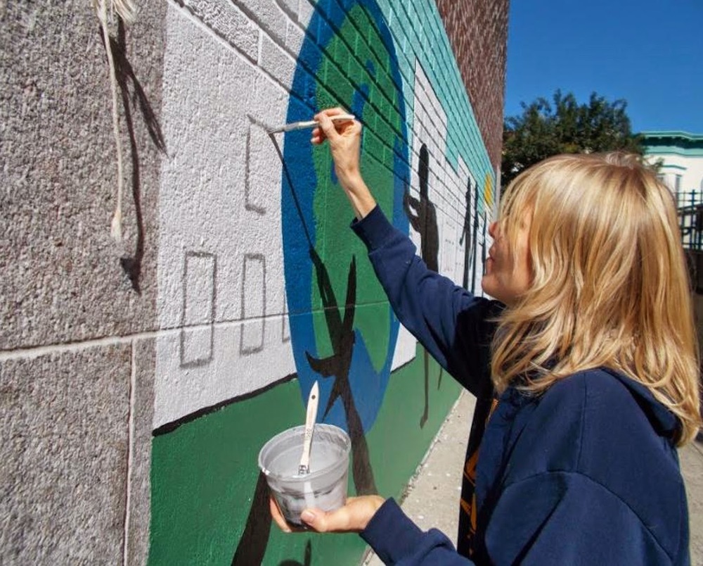
Here are a couple of shots of that completed mural, and one of me adding some finishing touches.
Your questions, comments and suggestions are always welcome. Thanks for stopping by!
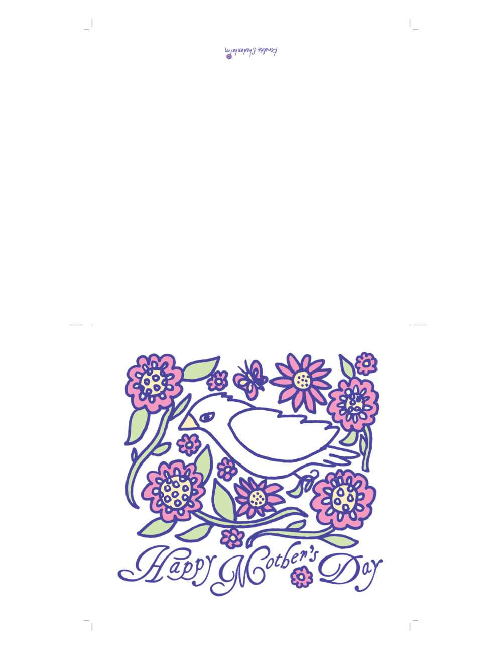
A Mother's Day note card for you.
If you'd like to download a copy of this little note card, I've created a printable page with crop marks and fold lines. You can either download this PNG below, or you can email me at kendrasred(at)gmail(dot)com, and I will send you a hi-res PDF.
Let me know if you have any questions. Enjoy!
Back to watercolor
More work with texture
Your comments and suggestions are always welcome.
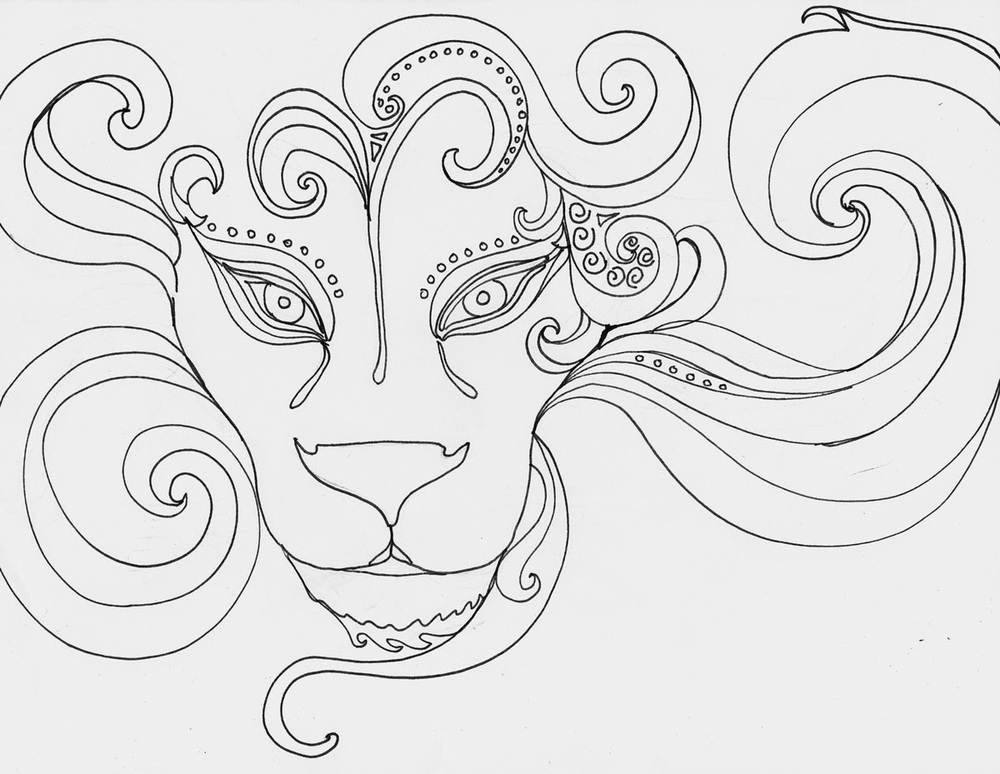
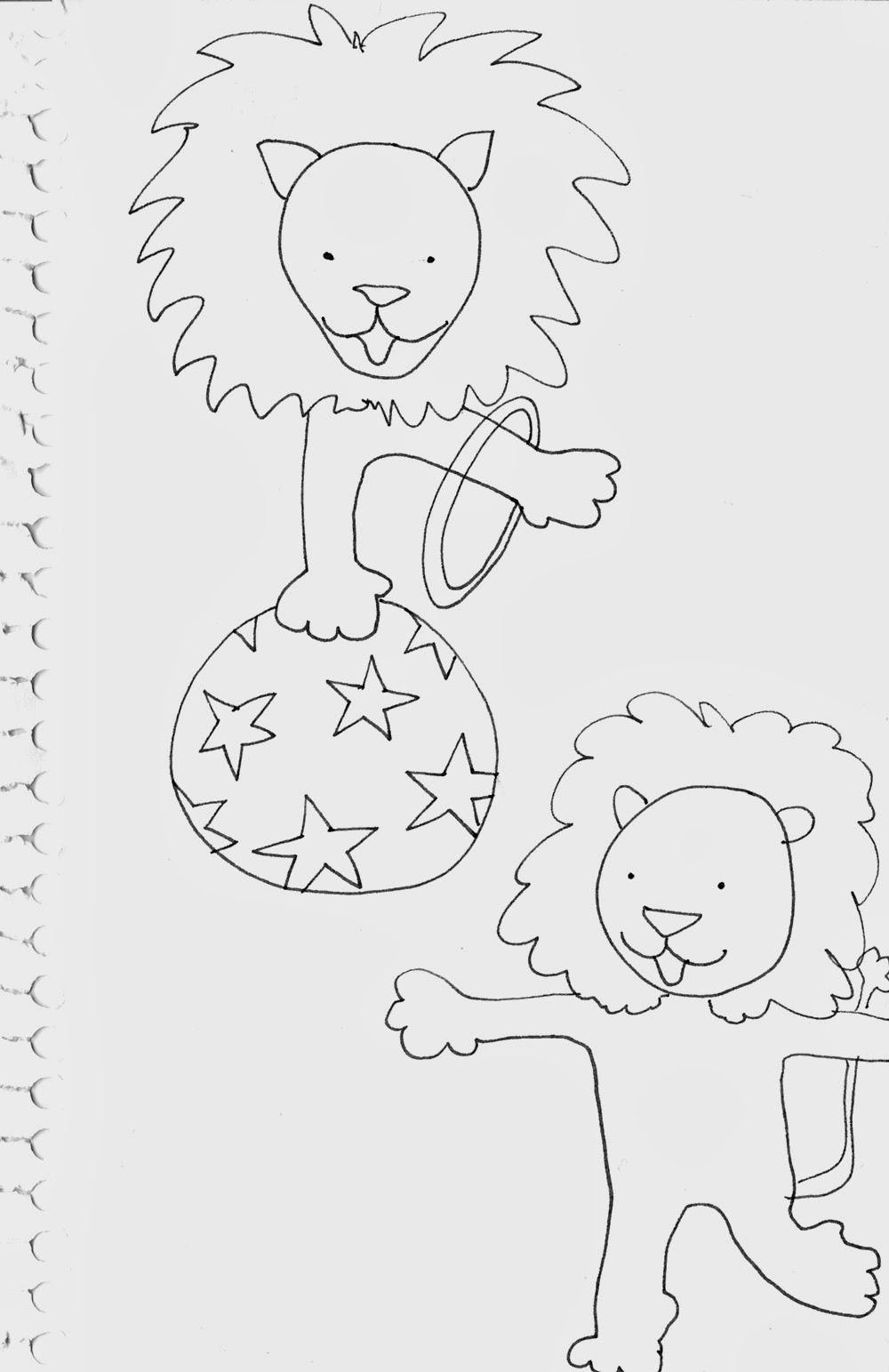
In like a lion
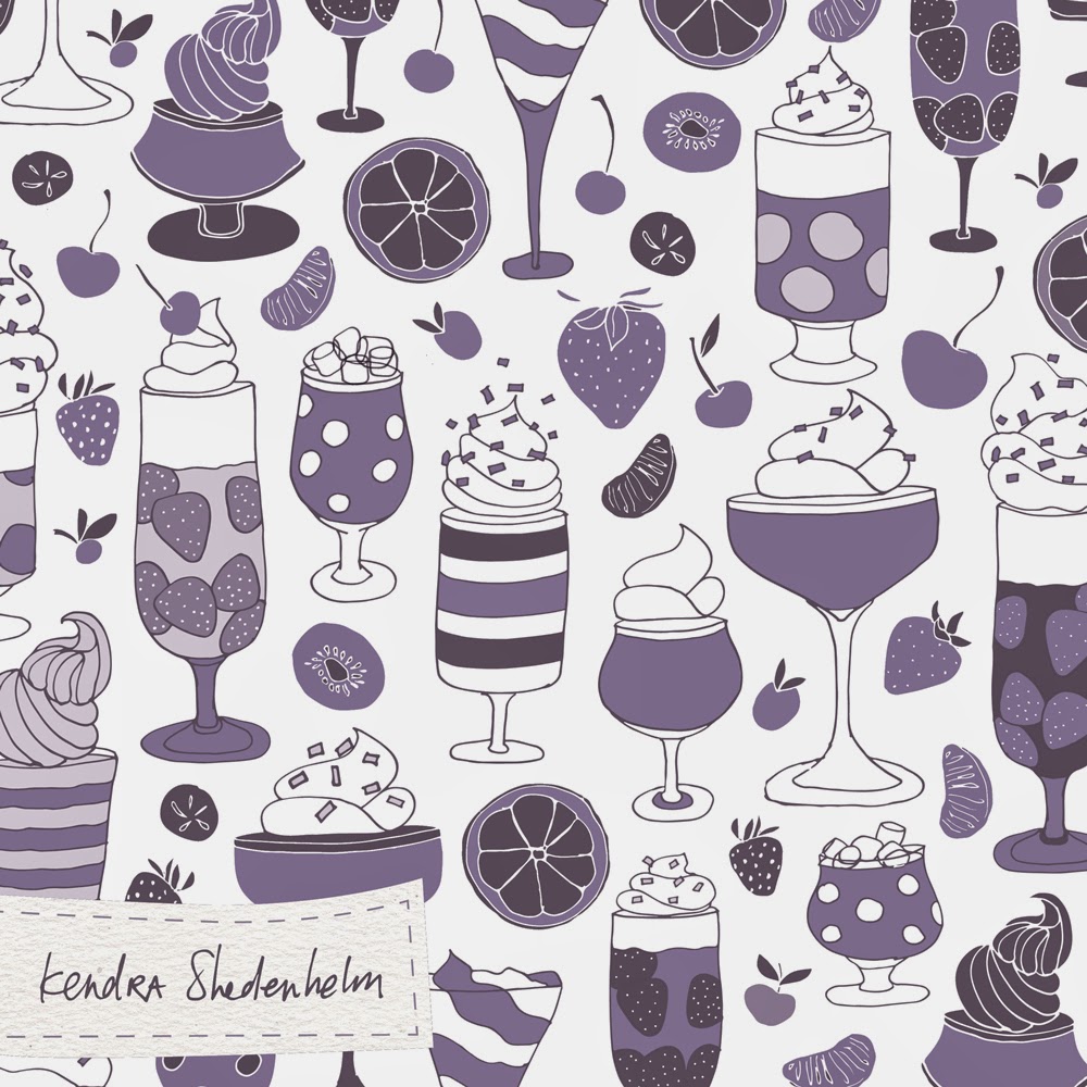
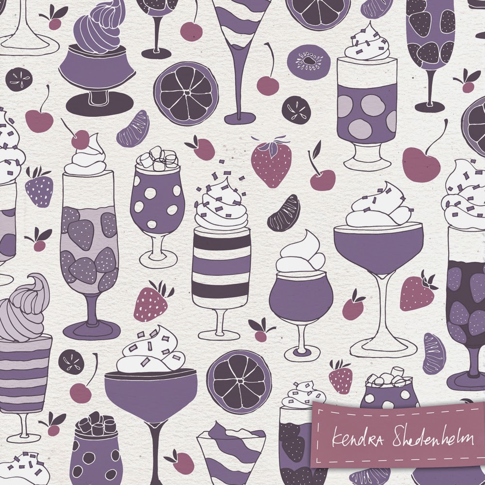
Lilla Rogers and Jell-O patterns
As with every Lilla assignment so far, it was another fantastic experience of learning, questioning, researching and drawing. Not only did I spend time checking out old Jell-O ads (totally enjoyable), but I also paid more attention to the patterns around my house, I drew gazillions of fun desserts, and I tried some new color combinations. Another perk this month was finding www.colorexplorer.com. Using the "Image Color Import" function, I was able to upload images that I was drawn to (my Ikea bedspread, a shirt at the Nintendo store, a mudroom on Houzz.com, etc.), and Color Explorer provided Illustrator-ready .ase swatches for me to use with my drawings.
I created several variations for my final assignment, but I went with this one in the end:
There were a few other contenders, too...
Which one is your favorite? And why?
I welcome your comments!
Textures and more bird sketches
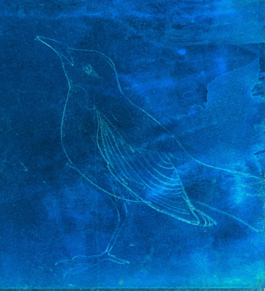
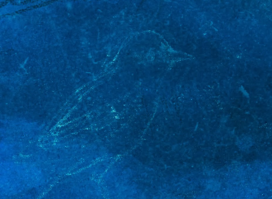
After I scanned these texture paintings in, I pulled out my white and graphite transfer paper and sketched on the still-damp paper. The wetness of the paper and the smudginess of the transfer paper give my drawings a dream-like quality, and I generally love the results.
On the cropped out sections below, I added some saturation in Photoshop to boost the background texture further...
How I will incorporate this particular background, I'm not sure yet. I am hoping for further instruction while I sleep tonight.
Your comments, questions and suggestions are always welcome.
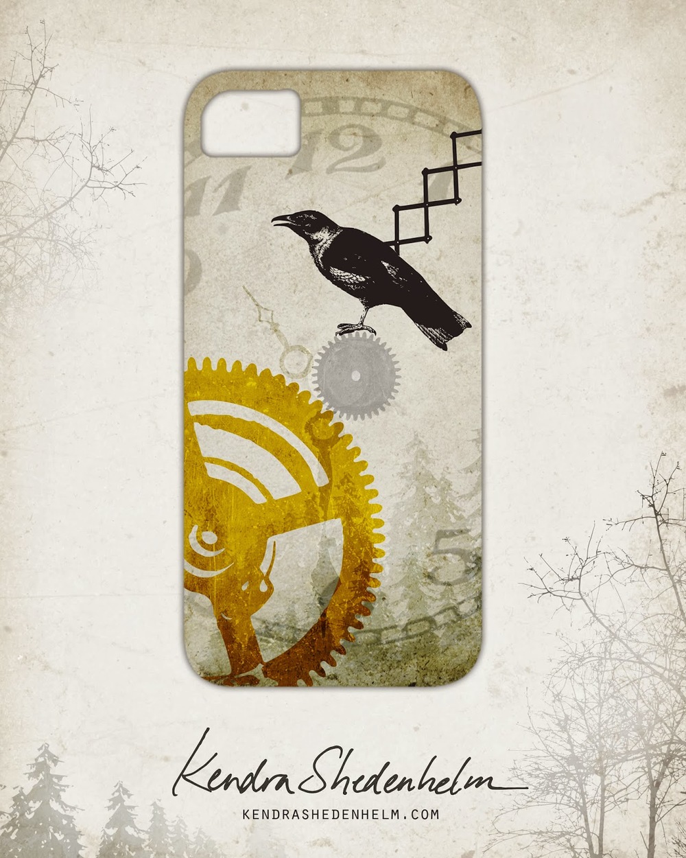
My final cuckoo clock submission
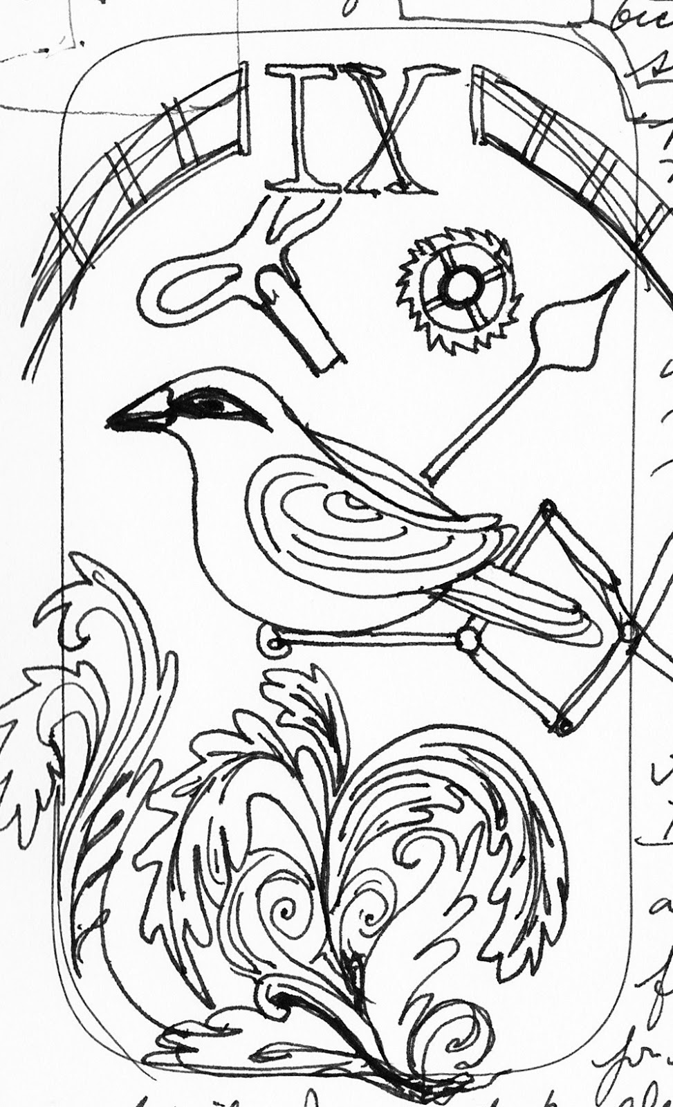
I wanted my cuckoo clock image to portray time as a bit static and stuck, but also very layered and rich. This is the image I posted to Lilla's online gallery...
MATS Bootcamp has begun!
- In Bootcamp, we get three weeks for each assignment, plus one week downtime before the next one starts. In MATS A, we had one week to complete an assignment and no downtime.
- Lilla will not be critiquing the class submissions as she had in the A course, so there is much less interaction with Lilla herself.
- Bootcamp is less expensive. Less Lilla, less $, I suppose.
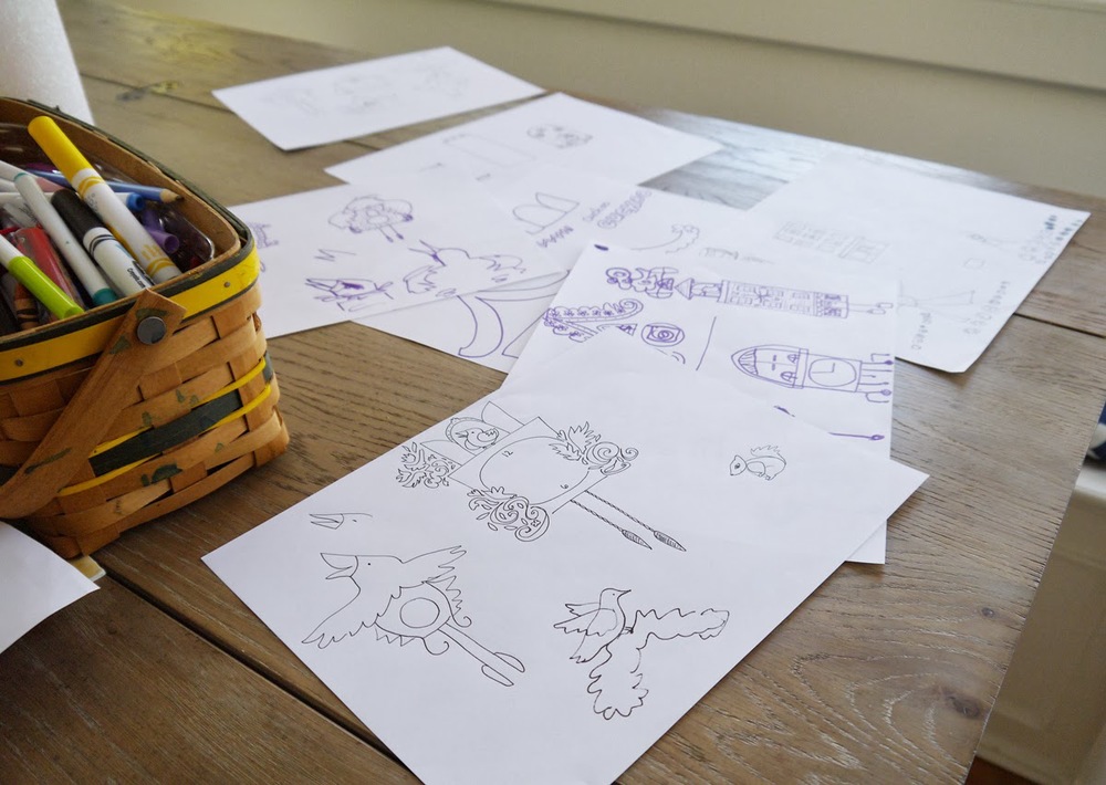
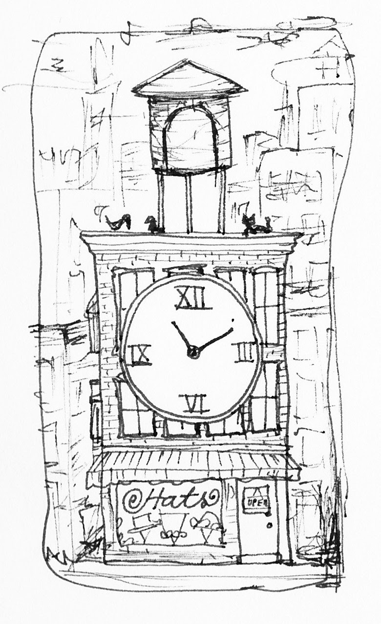
At the beginning of the second week, we were given our actual assignment: create a phone cover with a cuckoo clock theme. Because of the vertical nature of the cover, and because I love drawing city buildings, I began focusing on the cuckoo clock as a Brooklyn brownstone. Here are a couple of examples:
Snow days and a late Valentine's Day party
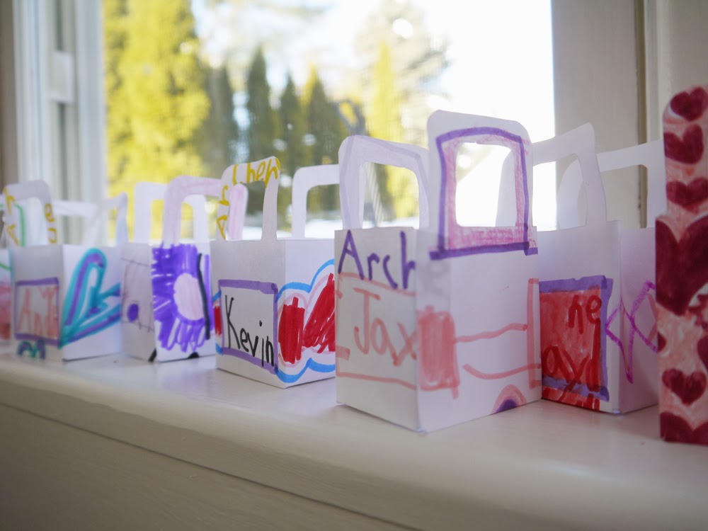
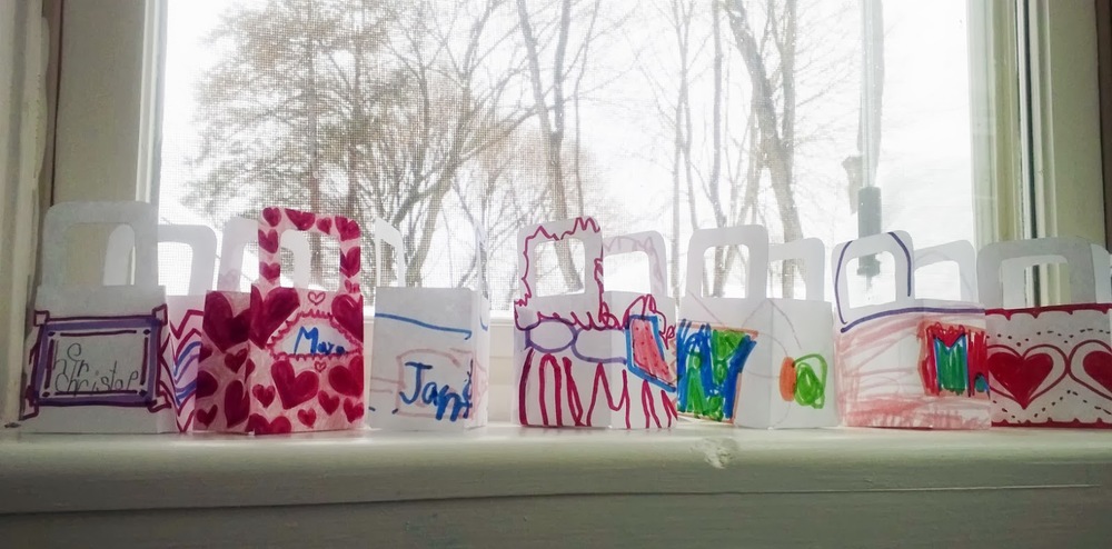
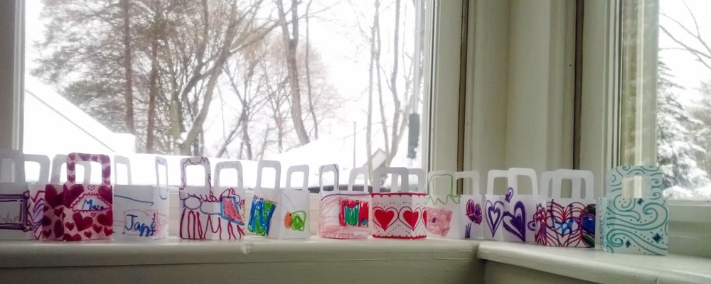
To get the ball rolling, I made some of the hearts and a few other decorations, but my five year old impressively put in another two hours coloring the rest. I did the cutting, and my husband did the gluing (with a little Mod Podge). Together, we made 23 of these:
We stuffed them with a piece of dark chocolate and a few heart stickers and sent them off with my son this morning. I am looking forward to hearing what the kids think!
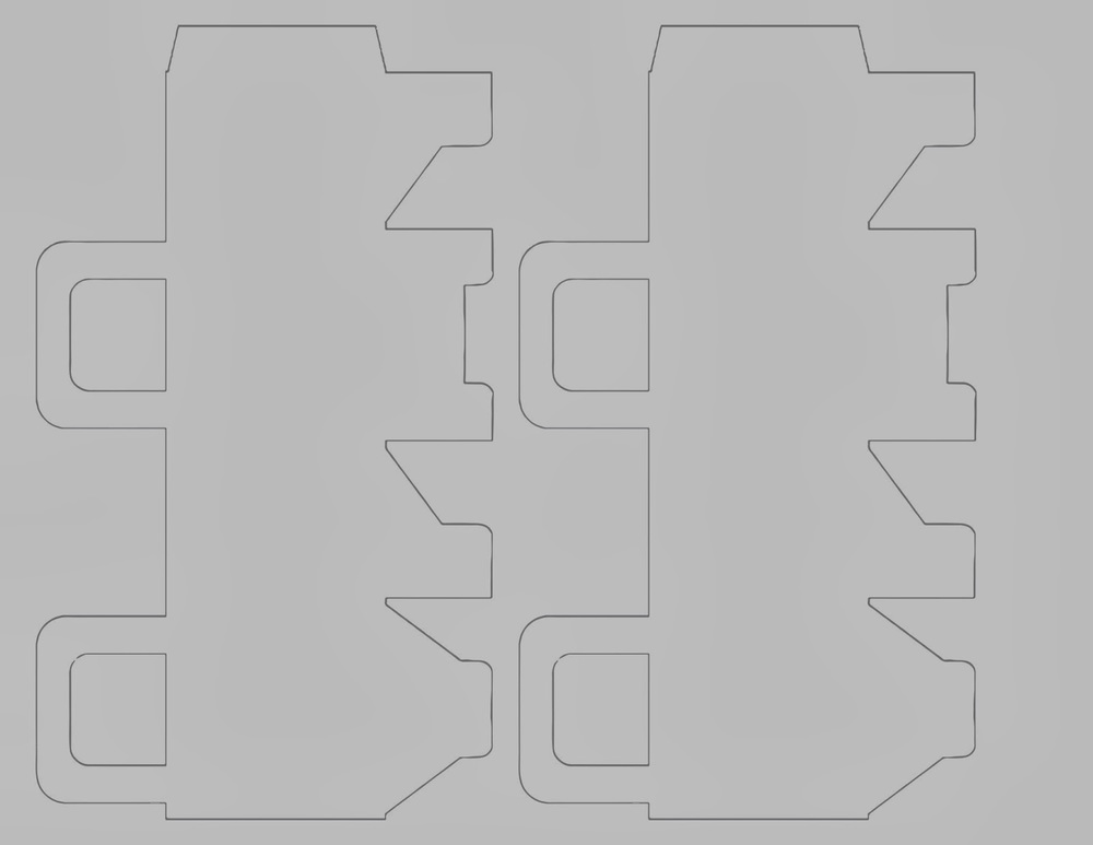
If you'd like a copy of this template, you can download this picture below (select Fit to Print on your printer), or leave a comment, and I will email you a PDF.
Happy belated Valentine's Day!
Lions and Leos
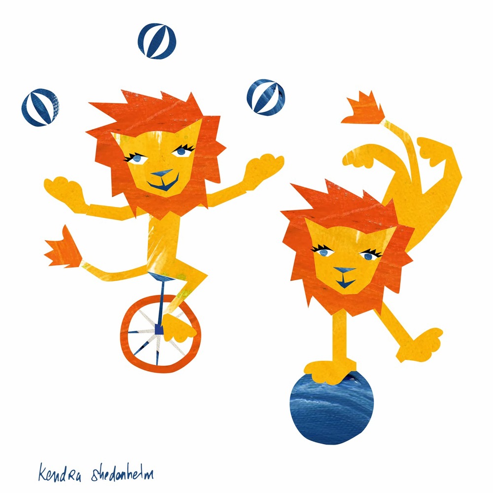
I will post again later with more little feats for my lion (and hopefully an entire pattern).